Member-only story
Accessible form validation from scratch — Styling
Part 4: Focus management, offloading to CSS, hiding irrelevant elements.
In this article, I’ll (finally) add styling to the form, attempting to maximize what CSS can do as opposed to using JavaScript.
In the next (and perhaps final) article, I’ll add JavaScript to perform the validation.
Introduction
Here are the links to the articles in the series (so far):
For this article, I’ll cover the following topics:
- Making our eyes hurt less
- Focus management
- Highlighting validation areas
- Hiding what’s not immediately relevant
- Using aria-invalid to show inline validation
- Bells and whistles
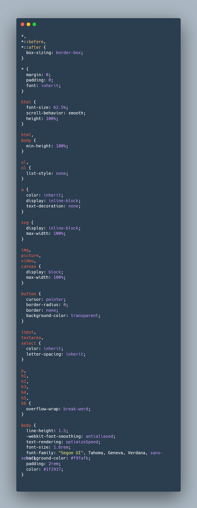
I’m going to try my best to keep the styling simple. I want to add focus when it’s justified and provide separation where it makes sense. The colors and fonts I use are quite basic. The styling is a template, little more. I’ll leave it to the CSS wizards to do their eye-candy magic.
Making our eyes hurt less
Here’s what we the solution looked like in Part 3:
Let’s make some minimal styling changes just to make it slightly more presentable. Here what we’ll add:
- Increase the height of the text boxes and the select control.
- Add greater padding and margin values to the input group, summary validation, and inline validation.
- Add a gray bottom border to the input groups.
- Increase the font size and weight of the labels.