You're reading for free via Shane P Williams' Friend Link. Become a member to access the best of Medium.
Member-only story
Part 4: Typography
Building a design system — where to start?
(Non Medium members can read this article for free here)
Colour, space and typography — these elements are the building blocks for a solid design system. They are distinctive visual elements to focus on when building a brand. Let’s take a closer look at typography…

What we’ll be covering…
Part 1 — First things first
Part 2 — Colour
Part 3 — Size and spacing
Part 4 — Typography
Part 5 — Bonus elements
Typography
We previously spoke about size and spacing, and how using measurements like REMs are dependant on a base typography measurement. These two concepts — size and space, are family members with typography, and often depend on each other. You’ll notice a few common themes between this and the last chapter in this series as we dive deeper into setting up type.
Much of this article focuses on design decisions that need to be considered as well as some technical considerations. It’s important for designers and developers to work closely together when building a design system, especially in the case of setting up typography.
Characteristics
Ether describes the characteristics of typography fitting into two categories:
- Inherent Characteristics are ones that are guided by the rules of typography itself. They don’t change based on context, and they include:
— Typeface
— Size
— Weight
— Line-height
— Letter-spacing - Contextual Characteristics can change based on the typography’s uses and goals in the interface. They include:
— Colour
— Spacing (padding, margin) - I would add to this list, and depending on your approach, the following characteristics could be contextual or inherent, they include:
— Letter-case (UPPERCASE, lowercase, Capital Case, Sentence case, “small cap”)
— Font-style (regular, bold, italic or underline)
Typeface
A Brand may have default typefaces that need to be used. In some cases you may need to choose new fonts that are more…
Choosing the correct typeface is crucial to your brand’s identity. Work with your brand team and ensure you adhere to your brand Corporate Identity when specifying fonts.
Choose a font
You need to choose a font, or a pair of fonts, that work well together. Again, the fonts you use may have already been dictated by your Corporate Identity guidelines, so consult with your brand team when deciding on the fonts you use.
Scale and size
Previously, when discussing size and spacing in a design system, I mentioned three general system archetypes addressed by Elliot Dahl. Here is how they apply to typography:
- Marketing — Built to tell a specific story and inspire visitors to spend their time and/or money on the site. More dramatic font sizes with larger differences in sizes resulting in more pronounced font scales.
- Editorial — To convey a large amount of information. The difference in font sizes is usually less dramatic in this case, with a smaller jump in scale compared to the marketing archetype.
- Data — Built to solve a user problem like filing taxes, managing a git repo, or visualizing performance metrics. Font sizes here can often be much closer in scale due to larges amounts of data that need to be presented, the ratio of font sizes is often much smaller than the two other archetypes mentioned above.
We also mentioned the concept of using a modular scale, and the same can be applied to typography. In fact, a modular scale is often used much more in reference to typographic scale than spacing. We also spoke about the 8 point grid system and setting a base font size to 16px for example. You can read some of those principles and approaches and also use them in setting up type sizes.
Jamie Gilman built a great browser-based tool worth checking out called Archetype, it embraces many of the concepts mentioned above but was built specifically to help achieve the following:
- Make picking appropriate font pairings easier and quicker
- Save loads of time creating rules-based styling and spacing for all the various typographic elements required for a design system (all whilst viewing how they will actually look in the browser)
- Generate the required CSS for your new styles at the touch of a button (an amazing time and effort saver for developer hand-overs)
- Export directly into Sketch to use as a part of your design system docs


Technically, you could specify your sizes manually or dynamically. Sebastiano Guerriero from CodyHouse asks and answers the question: Why including the type scale in your CSS? In one word: control. They have also set up an amazing design system template worth checking out. You may decide to use SCSS or LESS as an alternate approach, but the key take away is to maintain control and set scale in a dynamic way. The cascading effect and control this gives you will save you a ton of time when making changes in the future or building a design system that caters to two or more of the three architypes mentioned above.
Naming font sizes
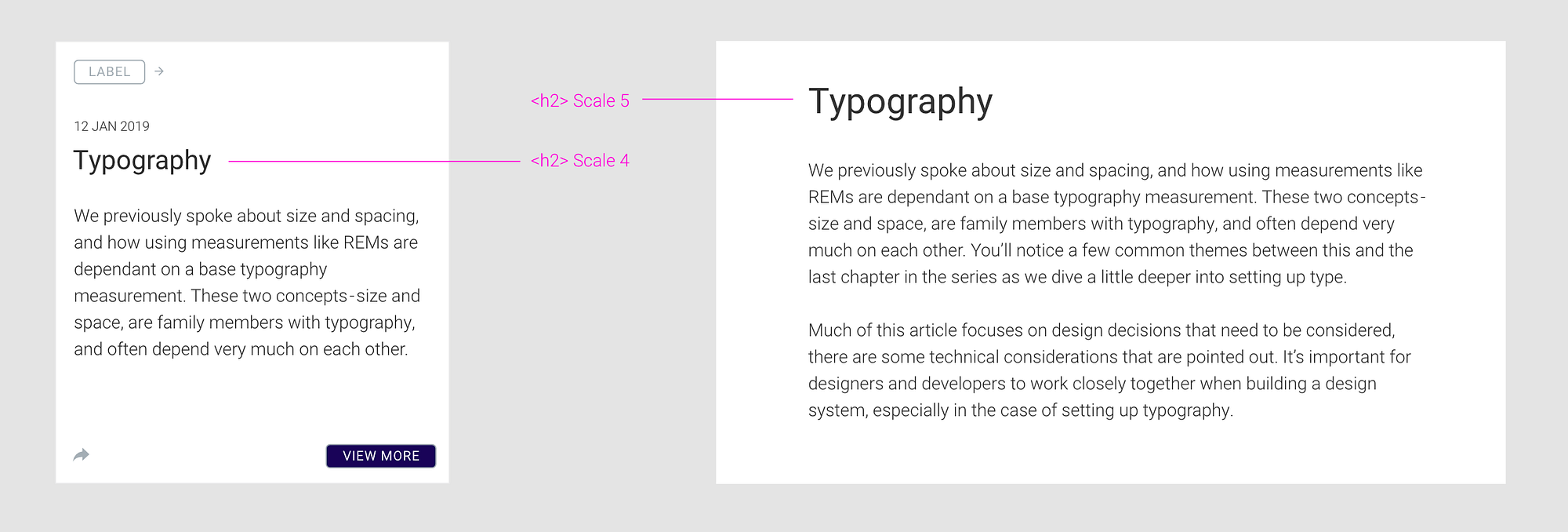
It’s not enough to pick your font sizes and assign them to headings like <h1> or <h2> —assign your sizes to tokens. Why? In HTML coding, the heading tags from <h1> to <h6> give semantic hierarchy for SEO, they do not represent text size.
You may use a <h2> title on a card at one size, and <h2> within an article page, but represented at a different size. Both may have the same hierarchy, but their use case is very different.
Paragraphs may also need to be represented at different sizes. Generally three different sizes may be required, a regular paragraph size, then a larger size for an introductory or lead paragraph, and then a smaller size for things like footnotes for example. Consider using token names like text-small, text-medium or text-large or using the common t-shirt size metaphor text-s, text-m and text-l.
Weight
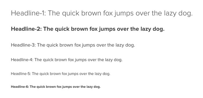
The weight of a particular font is the thickness of the character outlines relative to their height. A typeface may come in many weights, from ultra-light to extra-bold or black. Four to six weights are not unusual, and a few typefaces have as many as a dozen.
In CSS, you can specify font-weights other than normal and bold by using numeric font-weight values scaled from 100 to 900 (400 is the same as normal, and 700 is the same as bold).
Typically, heavier font weights are used for headings and titles, and lighter font weights for paragraphs. Be cautious though when using light font weights on smaller text, as this could lead to accessibility issues.
For a more polished typography system, instead of choosing one weight for headings, and a second for body copy, spend a little more time picking font weights for each different heading size that best compliment the overall hierarchy of your type.
Caution
Be cautious when choosing font weights, every additional weight you add, adds to the download size.
Line length
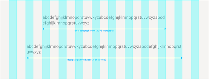
Line length is the distance between the left and right edges of a text block. Overly long lines are a common problem, but they’re easy to correct. Shorter lines will make a big difference in the legibility and professionalism of your layout.
Shorter lines are more comfortable to read than longer lines. As line length increases, your eye has to travel farther from the end of one line to the beginning of the next. If the lines are too short then the text becomes disjointed; if they are too long the content loses rhythm as the reader searches for the start of each line.
The suggested line length for digital text is in the range of 50 to 75 characters on a line. A good trick to measure the ideal line length is by using the letters of alphabet, if the alphabet fits within the space between two and three times, you’re in the safe zone.
With the advent of mobile screens, sticking to this rule can often lead to really small text on screens, this causes accessibility issues. I’ve found the ideal line length on mobile to be in the range of 35 to 40 characters per line.
Keep line length in mind when fleshing out your design system into components that display type.
Line height
Some modern design applications like Photoshop still use the term ‘leading’, while in HTML and CSS, the attribute is called ‘line-height’. Leading, line spacing and line height all refer to the same thing.
Line height, or line spacing, is commonly measured as a percentage of font size. Conventional wisdom is that line spacing of 130%-150% is ideal for readability, but even up to 200% is acceptable.
The perfect line height depends on the design and size of the font itself. There is no magic number that works for all text. A line height of 1.5 times the font size is a good place to start from, and then you can adjust accordingly.
Using an 8 point grid system works well when using 1.5 line height. A line height of 8 and a base font size of 16 fits perfectly to this principle.
For a more advanced way to calculate optimal line spacing and font size, check out the Golden Ratio Typography Calculator.
Justinmind.com dedicates an entire article to best UX practices for line spacing and uses the below example:
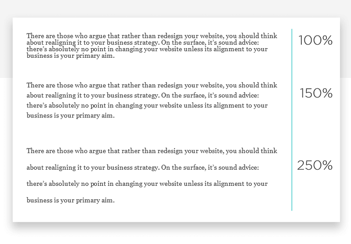
In the 100% paragraph, you can see that letters on adjacent lines come dangerously close to touching each other. The reason this is problematic is that people with some visual impairment will find it much more difficult to read. At 150%, it feels like the space is nicely balanced and the text is readable. Meanwhile, the paragraph with 250% spacing seems to be taking things too far — the line spacing is so exaggerated that reading the text feels unnatural.
~ Best UX practices for line spacing form justinmind.com
Line spacing as a % should actually increase with smaller font sizes. This is because smaller fonts are already more difficult to read, and need more space around them for the eye to easily follow.
Tom Clark at at Justinmind suggests these 6 golden rules for line spacing:
- Aim for about 140%-180% for optimal readability and accessibility.
- Limit line length to 70–80 characters.
- Font size should be a minimum of 16pt.
- Small fonts need more spacing.
- Experiment with tighter spacing on pull quotes or other short texts.
- Check your line spacing when you change font or font size.
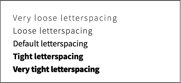
Letter-spacing
Letter-spacing refers to the spacing between each letter. Kerning and tracking are also terms that refer to this idea, but when working with digital type on the web, letter-spacing is the term that gets used. Very few web designers ever adjust letter-spacing when setting type on the web, but small changes can have an enormous effect on the readability of text.
John D. Jameson has written an excellent article entitled Guidelines for Letterspacing Type. In summary, this is what he suggests:
The relationship between font size and letter-spacing is pretty straightforward: as size increases, letter-spacing decreases, and as size decreases, letter-spacing increases.
- Capital letters — It’s almost always a good idea to increase letter-spacing with uppercase type.
- Large text (e.g., titles and headings) should have decreased letter-spacing.
- Body text should have default tracking, or stick very close to default letter-spacing.
- Very small text should have increased letter-spacing.
- Light-on-dark text — Light type set on a dark background usually benefits from a small increase in letter-spacing.
- Font weight — Like with font size, the relationship between font weight and letter-spacing follows a simple pattern: as weight increases, letter-spacing decreases, and as weight decreases, letter-spacing increases.
For a more in-depth explanation on how weight affects letter-spacing decisions, check out Carolina de Bartolo’s Typography Matters talk over on YouTube.
Letter-case
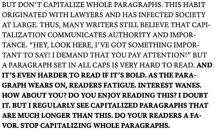
All-caps text — meaning text with all the letters capitalised — is best used sparingly. At body text sizes, capital letters — or simply caps — are harder to read than normal lowercase text. Practical typography explains that we read more lowercase text, so as a matter of habit, lowercase is more familiar and thus more legible. Furthermore, cognitive research has suggested that the shapes of lowercase letters — some tall (dhkl), some short (aens), some descending (gypq) — create a varied visual contour that helps our brain recognize words.
This does not mean we should never use all-caps. Using all-caps in buttons for example can help make a button appear more symmetrical within it’s boxed shape.
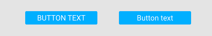
The capitalisation shouldn’t be used where reading long text is required. Use capital text in places such as tabs where user attention is important. A basic rule is to only use uppercase letters in headers, captions, or other UI labels where text length is shorter than one line.
Title case — this is the practice of making the first letter of each word upper-case. Typically it is recommended to only use this in the case of headlines and possibly labels. This visually separates the headline from the other content, which helps the reader know where an article (or a section of it) begins. Apple’s design guidelines recommend title case for many UI elements, including alert titles, menu items, and buttons.
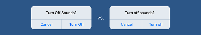
Sentence case — With sentence case, you capitalize the first letter of the sentence (and any proper nouns). Sentence case looks casual, cleaner, improves readability and nobody ever complained that sentence case caused them any loss of business. Google’s Material Design follows it earnestly.
However you decide to deal with your letter casing, one key take away is to remain consistent on how it is applied throughout your design system.
Font-style
What I am referring to is the style applied to text; like bold, italics and underlines.
Practical Typography have the following to say about bold and italics:
- Bold or italic — think of them as mutually exclusive.
- Use bold and italic as little as possible — They are tools for emphasis. But if everything is emphasized, then nothing is emphasized.
- With a serif font, use italic for gentle emphasis, or bold for heavier emphasis.
- If you’re using a sans serif font, skip italic and use bold for emphasis — most sans serif italic fonts just have a gentle slant that doesn’t stand out on the page.


When it comes to underlines, reserve this exclusively for links. Since the beginning of the web, underlines have been used on links, if you use them for any other reason, users will expect them to be clickable.
REMs vs Pixels
We spoke about the concept of using REMs and Pixels in the previous article on size and spacing, there is some very practical advice there on deciding on what measurement to use.
If you use REMs, set your base font size up on the root element. On web, this would be on the body tag. All other font sizes then become a multiple of this base font size. Your base font size will always equate to 1rem.
Example:
If you set base font to 16px, 1rem equals 16px.
Represented in units, fonts would then look something like this:
Paragraph = 1rem (16px)
Heading 1 = 2.5rem (40px)
Heading 2 = 2rem (32px)
Heading 3 = 1.5rem (24px)
line-height = 1.5rem (24px)
Colour
We also spoke about choosing colour in part 2 of this series. Consider how colour will be applied to typography.
- Pick your base font colour (usually black or close to black) and then any overrides for specific use cases like alerts messages.
- Assign a specific colour to links.
- Decide on specific colour applications for components. For example, a button could possibly use a tint from the base button colour.
- Consider text that needs to appear on dark and light backgrounds.
Erik D. Kennedy at learn UI has built a great accessible colour generator worth checking out, this helps pick text colour in contrast to another colour.
Accessibility
Accessibility is the inclusive practice of ensuring there are no barriers that prevent interaction with, or access to, websites on the World Wide Web by people with disabilities. When sites are correctly designed, developed and edited, generally all users have equal access to information and functionality.
~ Wikipedia
But, accessibility applies to more than just the web, accessibility needs to be considered across all digital products, and therefore, considered across your design system.
This entire article is littered with references to accessibility. To recap, here is a list worth considering when approaching typography and accessibility:
- Font size — i.e body copy should not be smaller than 16px
- Font colour — always consider colour contrast
- Font weight — i.e lighter fonts can be hard to read at small sizes
- Letter-spacing — tighter spacing on large text and broader spacing on small text can improve accessibility
- Line height — visually impaired people will find copy hard to read if the line-height is set to 100% or large spacing like 250%
- Letter-case — i.e. don’t use all-caps for body copy.
Conclusion
As with any design project, guidelines and tips are a place to get started. Build good typography practices into your design system to ensure typography is used correctly, adheres to UX and UI principles and accessibility guidelines.
Next up…
We’ve tackled concepts like design tokens and principles, setting up colour, size and spacing and now typography. Get these three elements right and you’ll have a solid foundation for your design system. But design systems are made up of much more than just these elements. The last article in this series examines some additional building blocks you’ll need to consider.
Part 1 — First things first
Part 2 — Colour
Part 3 — Size and spacing
Part 4 — Typography
Part 5 — Bonus elements


