Member-only story
Button labels: is “OK” ok?
Buttons are amongst the most important interactive design elements that allow users to manipulate the interface. There are many great articles dedicated to their appearance, yet surprisingly little guidance on their content — labels.
I’d like to preface this article with a note that the following principles should be used as guidelines, not rules. Language changes in response to its context and evolves over time, so trust your instincts, stay consistent and test extensively!
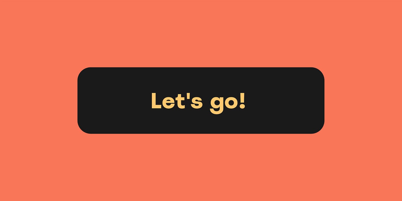
Light, camera, action!
A button is an interactive element that changes the state of the interface (if it doesn’t, it’s should likely be a link). For this reason, its label should include a verb that clearly describes the action it performs.
Let’s now look at some of the most common actions and the best button labels for them.
Confirmation
By clicking the button, the user confirms that they familiarised themselves with the information and accept its message. The most common labels for this are:
- Accept
- Agree
- Confirm
The choice will depend on your tone of voice, as well as the formality of the agreement.

Conversely, you may need to give the user an option to “Disagree” and label the button accordingly. However, since the progress often relies on the user agreeing to whatever information they are given, it is more common to pair the confirmation button with labels like:
- Cancel
- Dismiss
- Go back
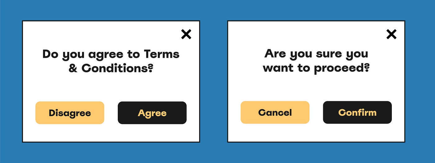
One notable exception is the “OK” button, which is often used to dismiss modals. This label is ambiguous, since it lacks an action word, so it’s not always…


