You're reading for free via Christine Vallaure's Friend Link. Become a member to access the best of Medium.
Member-only story
CSS Container queries: why we must consider them in Figma and how to implement them
A new responsive design approaches beyond breakpoints

Container queries are a groundbreaking concept in the world of web design and have the potential to fundamentally change the way we approach responsive design in the browser. As the design landscape evolves, it becomes essential to envision how container queries will impact our design processes in Figma.
In this guide, we’ll explore the current design approach using breakpoints and how it might change with container queries. We’ll also investigate how to leverage the existing Figma features to design for container queries to create fluid and adaptive user experiences together.

Note: It’s a little hard to put an actual number on this because there is a significant gap between something being available and widely supported.
First things first: Responsive web design with media queries and breakpoints
Let's start with the basics and the status quo and ensure we are all on the same page. What is a media query?
📍Note: There are alternative techniques for achieving responsive design that do not rely on breakpoints. For instance, working with pure flexbox or CSS grid setup. Additionally, when it comes to adjusting text size, clamp() offers a fantastic way to control typography dynamically. However, in order to comprehend container queries, it's essential to first have a solid understanding of the media query setup. Despite these alternatives, media queries and breakpoints remain the widely used and go-to approach for establishing responsive design in the present day.
Media queries tell websites how to adapt their appearance based on the viewport size. Breakpoints are specific points or, rather, thresholds where changes occur. This way, websites can adjust their layout and styles to fit different screen sizes, ensuring that they look good and function properly on various devices.
Here is a simple example of a media query in CSS:

The @media rule is a way to apply certain styles to a webpage only if a specific condition is met. In this case, the condition is min-width: 768pxif the screen’s width 768 pixels or larger. So, anything inside the curly braces { ... } will only be applied to the webpage when viewed on a device with a screen width of 768 pixels or more.
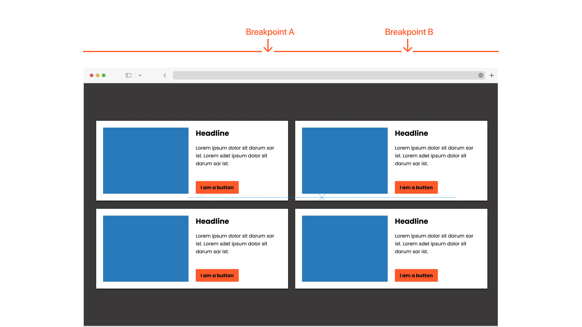
There is no set rule for the exact number of breakpoints to use. The standard level is typically three to five, I would guess (e.g. Tailwind default setting). But you can use as many and as little as needed.
I made a little code pen so you can play with Breakpoints yourself to understand them better.
How does this work in Figma?
We do not have breakpoints and media queries as such in Figma, but we can get close with auto layout, min-max settings and variables. More info in a detailed tutorials about responsive design with Figma.
What are container queries?
A container query, on the other hand, is a feature in web development that allows the styles and layout of a container element to change based on its own size rather than the size of the entire viewport (screen). In other words, it enables elements within a container to adapt their appearance and behaviour based on the available space within that specific container.
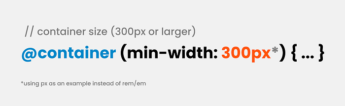
They look pretty similar to media queries; the@container rule with min-width: 300px means that the styles within the curly braces { ... } will be applied to an element when the width of its container is 300 pixels or larger.


The fundamental difference is that media queries react to viewport size, while container queries respond to their parent container size.
This allows the element to adapt its appearance based on the size of its parent container rather than the overall viewport. Container queries provide more fine-grained control over element styling based on container size, enabling more modular and flexible designs.
Charis from Smashing Magazine was super nice to set up a little container query code pen so you can play with it, thank you Charis!
📚Further reading
I highly recommend everything by Ahmad Shadeed, an excellent detailed article about responsive design and its developments as well as lots of examples around container queries.
Can I already use container queries?
It is important to note that I am explicitly referring to size container queries in this article. It’s worth mentioning that there are other types of container queries, such as style container queries, which are still in development and not widely supported at this time.
Even though it is still early days, size container queries are looking very promising; however, older browser versions will not support them. Make sure you have a solid fallback option, though, but we need to accept that they are most likely not giving us identical output.. Still, we are ready to prepare the road for container queries for sure!
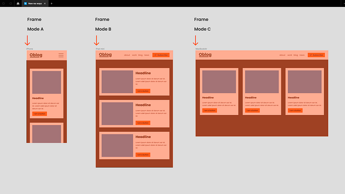
Setting up UI designs in Figma for container queries.
In Figma, we don’t have media queries or container queries as such, we currently also have no way to find out what size a container has, or in short: We cannot query! But we still have plenty of tools to communicate our design intentions to development. Let me show you some available options we could use. Note, this is an early days exploration.
Figma Variable modes! Sorry but not really working for this one.
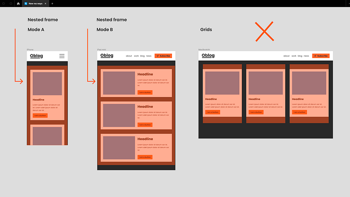
Variable modes might be the first thing that comes to mind. Modes are fantastic when working with breakpoints and assigning variants or booleans to the correct component. But remember we have different set brakpoints and each frame represents one with a mode assigned.
So, it may seem straightforward to add a mode to the container. However, I have encountered a few hurdles:
- As mentioned earlier, we cannot query the size directly, so manual switching would be required, a source of error and very frustrating to work with.
- Figma heavily relies on nesting, so we would have to run through every subframe. Very frustrating and a source of error.
- Container queries often work hand in hand with CSS grid, which is not available in Figma.
Despite these challenges, Figma still provides various other tools to effectively communicate design intentions to developers. Let’s explore:
Achieving container query-like effects in Figma with variants.
In Figma, the parent container (usually a frame) would require using container queries. However, Figma does not currently support querying. But, it’s not a significant issue, as the responsive information from a container query is stored within the component itself, and this can be achieved in Figma. By creating variants for different container sizes, we can design how our component would look at different sizes.


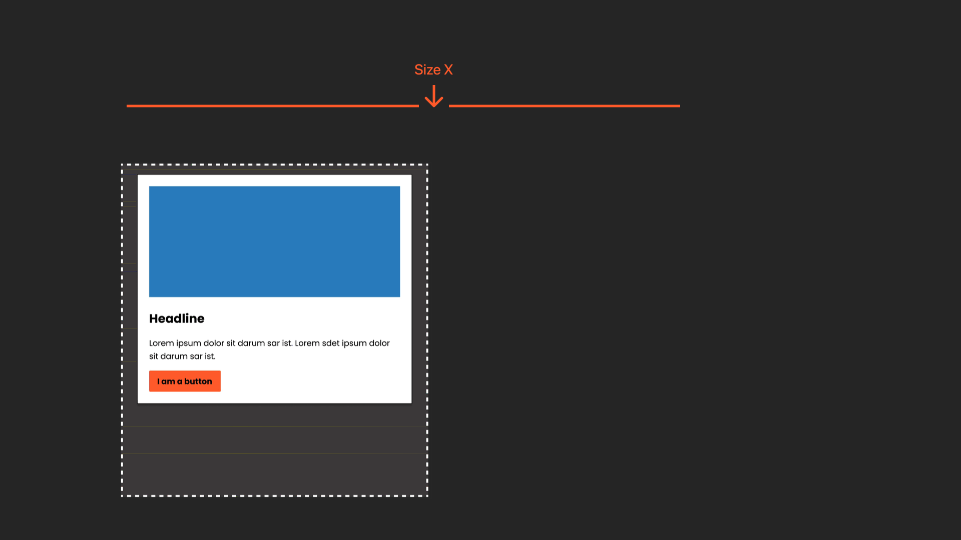
Okay, so basically, we want different versions of the component (this could involve a change in layout, typography, showing/hiding elements, etc.) and find point X where it would change from one version to the other. Then, we need to document it so that everyone is aware of it.

Great! Let’s take a look at the tools we would need for this. We will set up component sets with variants, apply auto layout for responsive behaviour, and set minimum and maximum widths.
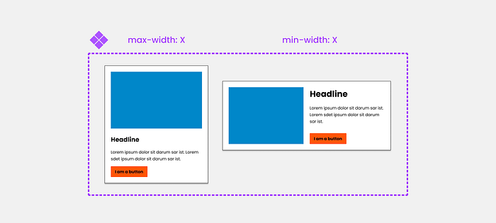
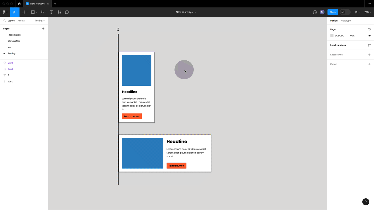
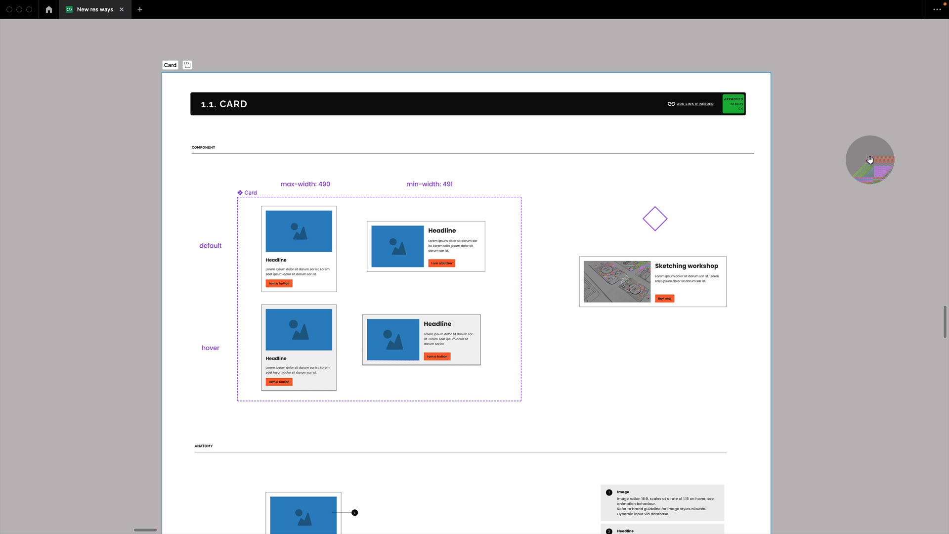
Step 1: Let’s set up a component set with two variants.
I have set up a component set with two variants. You can see that I have already named them “max-width: X” and “min-width: X”. Feel free to adjust these names according to your specific needs. You might also use < than or > larger than or anything else describing the property.
Step 2: Find the transition point
Let’s determine the specific point where we want the first variant to stop and the second one to take over. For this purpose, I am setting up a testing page.
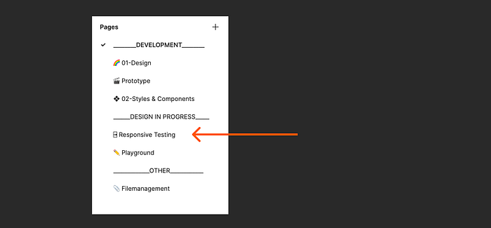
🚩IMPORTANT: This is intended only for the design team’s experimentation and testing purposes. It will not be visible to anyone who consumes or codes this component in the future. It is expected to be messy and experimental, as our main objective is to identify “point X.”
Step 3: Add auto layout and our min and max values.
Your component needs to be set up as an auto-layout component. You can then add the min and max values we just found out to this component via the menu. Additionally, I recommend adding them as a description for clarity, although it is not mandatory.
Step 4: Let’s ensure all property naming aligns.
To make it straightforward for anyone using an instance of this component or inspecting it in dev mode, let’s add the transition points we found to the name of the variants’ property. This way, it explicitly indicates the purpose of the property. Additionally, I suggest changing the property name itself to “@container”. Although it doesn’t affect functionality, it indicates its purpose. Just a suggestion I am still testing out, though: feel free to disagree on this one and follow your team's naming convention.

Step 5: Let’s have a look at what others would see.
Now, let’s pull out an instance of the component. We can observe that we have a property called “@container,” which indicates the points where it needs to be swapped. Please note that this process may still be manual and tedious (apologies for that!). By the way, you can also choose to name this property as “> XY” or “< XY” if you prefer. The important thing is to remain consistent in your naming convention.

In dev mode, which is what our developers would see, we also see this property and can open the property's playground to see the two versions. The CSS it generates may not be correct, but it effectively communicates what we are trying to achieve. However, I recommend adding more detail in the form of documentation. I will address this shortly.
Can we push this further? Yes! Add min to nested frames and set to wrap! (works for some)
Well, yes, a little bit! But it only works for this specific case where we only change the direction and not dynamically swap text size or show and hide elements.
Instead of using variants, I could add minimum values to the nested auto layout frames that hold the image (blue rectangle on the left) and the content (text and button on the right). Now, if I switch my parent container to wrap, it will wrap the right-hand side content, positioning it below the image as soon as we reach the minimum width. I can also clean up the code and add minimum and maximum width to the parent. And voilà! It looks pretty much like a real container query, and we can eliminate our component set.
Careful, no CSS grid but a flexbox setup in dev mode!
Now it does pretty well mimic what we are aiming for. However, if we switch to dev mode, we will see that it is set up as a flexbox layout (and we can now switch between using pixels and rems, which is a fantastic feature).

In CSS container queries, however, you will often find that this type of arrangement is accomplished using a CSS grid, as shown in the earlier codepen example by Charis. Regrettably, Figma lacks CSS grid capabilities, so the generated code won’t precisely match that example. Nonetheless, the concept will be effectively conveyed, particularly with the proper documentation, we will get there in a minute.
But we are still swapping instances manually like this, you might say.
That is very true, and it’s a shame that we can’t add more logic and query in Figma (which I’m sure is on the horizon). But for now, let’s focus on our actual goal.
Figma is not code, and that is okay!
Our goal is to communicate the use and handling of this container query component to our design team, working with it, as well as to our development team building it.
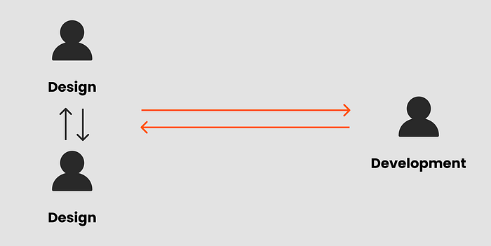
So, let’s add a step! Let’s… yes, you might have guessed it, my favourite thing! Let’s document everything so that everyone, and by everyone, I mean other designers and developers, can understand what we are trying to do and communicate. Needless to say, this should be accompanied by regular check-ins between design and development.
Documenting container query components
I will use our variant example for this one. Also, your documentation might look different; it might be longer or shorter, in a file, in a library, or on your own external page/design system — that is just fine. Documentation can come in all shapes and forms; the important part is to consistently communicate crucial information to all team members so that it works for everyone. So here is my example for our card; let’s run through it:

Step 1: Always use sections for your component documentation!
Draw a section by simply hitting Shift+S. Always place your components on sections, not on frames (as we used to). There are a lot of benefits, like quick identification of icons for components, creation of folders in the assets panel, and you can place frames on sections for sub-organization and to quickly demo interactive behaviour. I talked about sections and their benefites during Figma Config 23; I love them! Also, since Config 23, you can mark sections as ready for development, sweet!
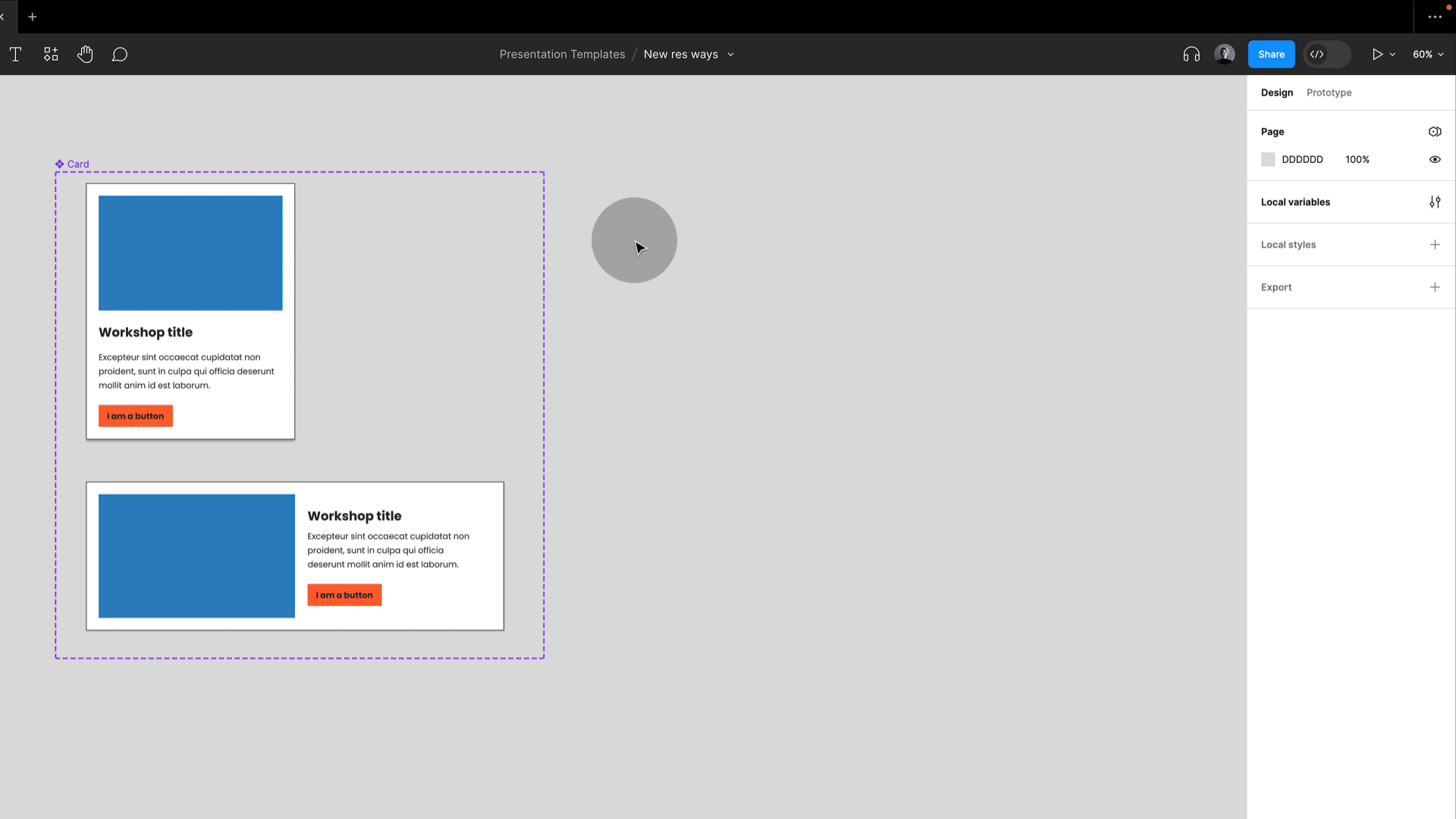
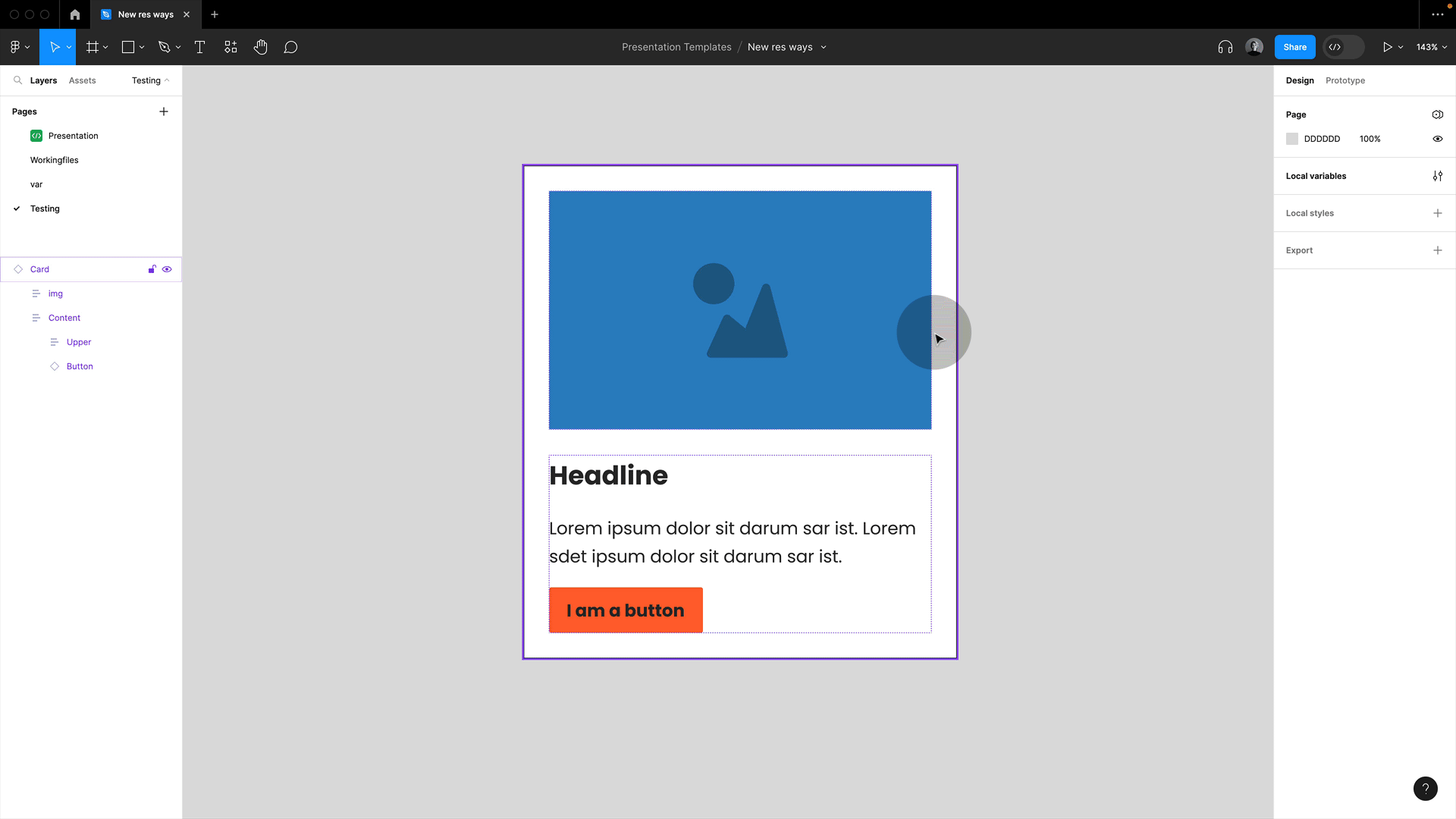
Besides adding my component or component set, and I also like pulling in an instance with some content to show a more realistic version.
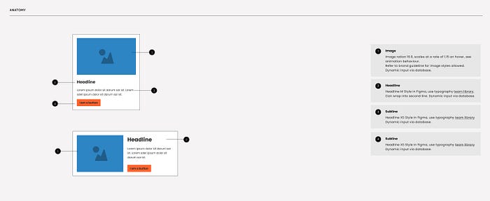
2. Anatomy
In Figma, including the component anatomy in your documentation is crucial because it helps both designers and developers understand the internal structure and behaviour of the component within the Figma design file.
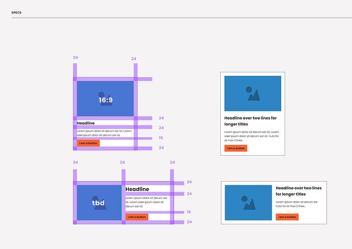
3. Specs
I still like adding the component specs, but with the new dev mode, this is not relevant anymore. Valid point. I also like showing versions with more or less content here.
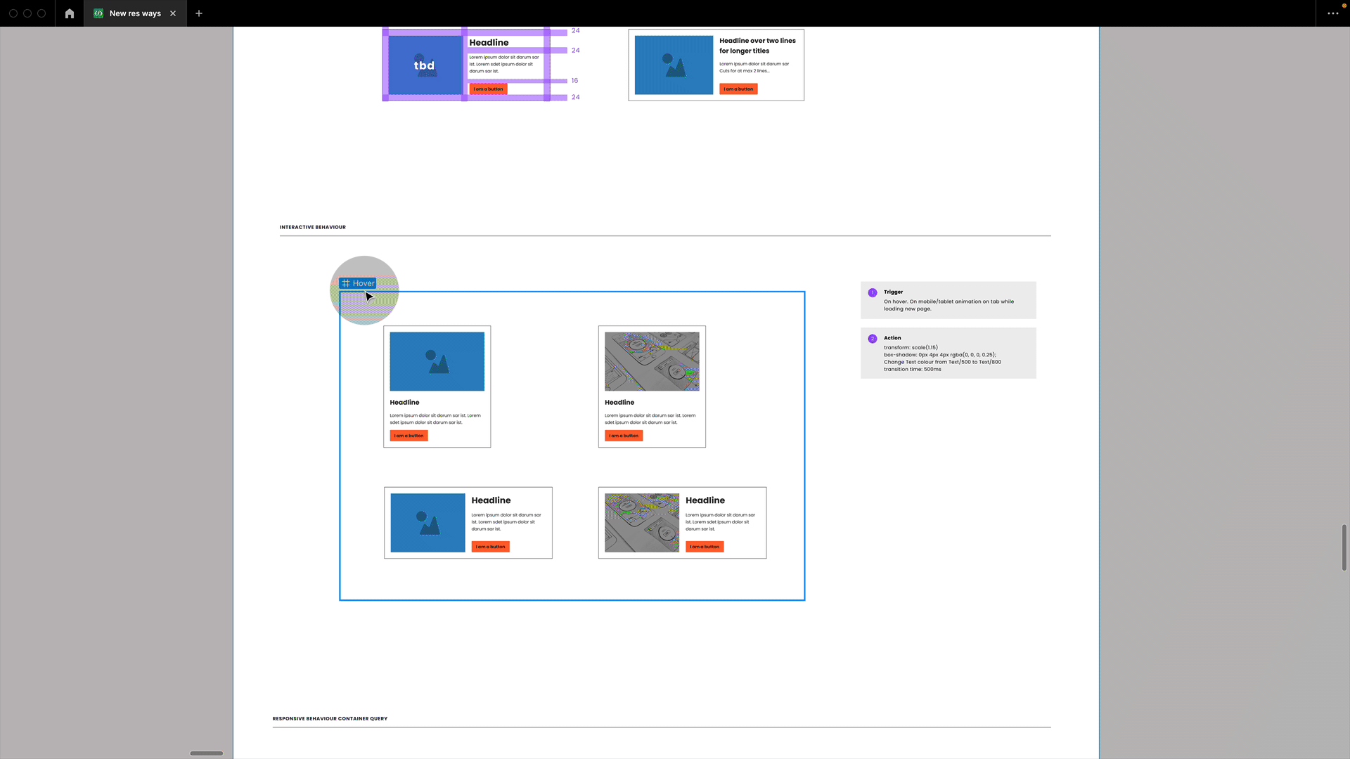
4. Interactive behaviour
This is where sections come in handy again, as I can now place a frame with instances onto my section, which can be used to demo interactive behaviour, such as hover states.
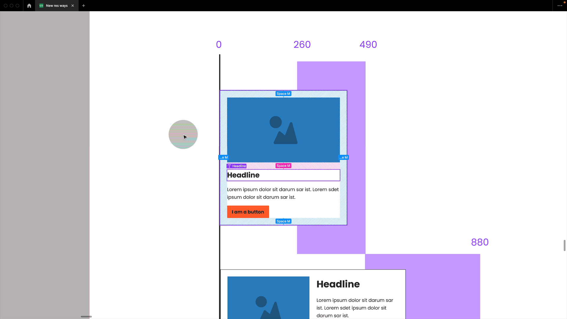
5. Responsive behaviour
Here we go. This is the part of the documentation we are after. For a container query component I made in Figma, I can give an overview showing the minimum and maximum width and clearly illustrate where the container query kicks in and the design changes.
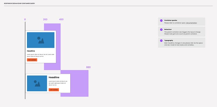
Extra: By the way, in case you are using a classic grid with breakpoints, the responsive information might look like this:
In case you are also using breakpoints with grids, then add this here.

And what do we see in dev mode:
If we mark our section as “ready for dev,” this will show up on the top left to anyone viewing the file in dev mode. We could adjust the units, e.g., from px to rem, and we would see all the specifications and could inspect our components. I also love the properties playground, where we could switch between the properties and get more info.
Tip: Automate your documentation in Figma.
Documentation can be time-consuming, but you can streamline the process by using the Eight Shapes Specs plugin to automate documentation.
It will generate frames with all the necessary information, and you can easily drag and drop them into the section below your main component. This will save time and effort while keeping your documentation organized and up-to-date. However, it’s important to note that the plugin does not cover the responsive part, so you would need to add this manually, whether you are dealing with standard breakpoints or container query information.
There is more..
This was a very brief and simplified introduction to container queries, but there’s much more to explore! A few key points to take note of:
- You can nest container queries (e.g., a button inside a card).
- They can, of course, be combined with breakpoints.
- They can also be combined with CSS grid.
- There are container query units (cqw, cqh, cqi, cqb, cqmin, cqmax).
- You can indicate in CSS whether a container becomes a container query container or not — it’s your decision, not automatic!
- Container Style Queries are in development, but they are not widely supported yet.
Conclusion
Container queries are one of the most thrilling advancements in modern CSS, all set to shake up how we tackle responsive design.
While Figma doesn’t mimic this behaviour yet, as you’ve seen in this article, we can get pretty close. By thoughtfully setting up our components and documentation, designers can employ instances correctly, paying respect to a container query setup in the background. Most importantly we can effectively communicate with the development team to plan the next responsive steps together.
Further resources:
- Miriam Suzanne: CSS Containers, What Do They Know? CSS Day 2023 🔥 amazing talk!
- Una Kravets: Container queries — Designing in the Browser
- Container query polyfill
- ishadeed.com
- CSS Container Queries: Use-Cases And Migration Strategies
- A Primer On CSS Container Queries
- Working with breakpoints in Figma: Testing and documenting responsive designs
Stay in touch!
I hope you found this article helpful, if so, please leave a clap! Make sure to subscribe to my articles here on Medium and follow me on moonlearning.io, Twitter, or LinkedIn where I teach and talk about UI Design, Figma + Code.


