Designing future-proof gradients
Is having gradients in your design dooming your product to be outdated or keeping it relevant? In this story, I explore how to integrate modern design trends while maintaining a classic and timeless aesthetic.

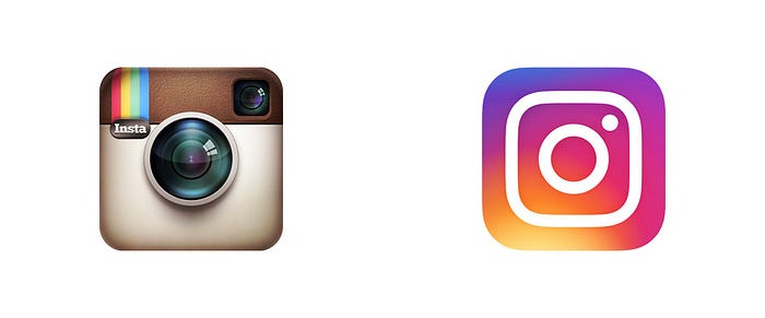
When Instagram debuted their new minimalist logo in 2016, it featured a bold and bright gradient that immediately found itself at the bottom of an internet dogpile. What was once a nod to the leather-backed analog cameras that inspired the film-processed filters (and inspired countless wannabe hipster photographers) was now trying a little too hard to be modern and new-aged.

I myself remember remarking on how unsophisticated it seemed and reveled in reading the internet collectively dunk on the designers. According to the hive mind of online forums, these designers did nothing but slap on a Microsoft Paint gradient and call it a day.

In hindsight, it seems that we were the fools. In the four years since Instagram’s redesign, we have come to love the new look and see the artificial bevels of the analog camera as the dated design. Precipitated by the minimalist aesthetic of iOS 7's debut in 2013, gradients have taken over the mainstream visual design aesthetic and continue to influence everyone from high-profile tech companies to social media startups.
Even if a gradient isn’t at the center of the logo or design, odds are that one is featured elsewhere in the interface whether it’s the backgrounds, buttons, or icons. This is especially true in the world of mobile app design where nearly every splash page showcases a colorful gradient, inviting the user in with a warm and welcoming huge.


There is a good reason for this resurgence of gradients, however. With the resolutions and clarity of modern devices, we can see more colors than ever before on our smartphones, laptops, and televisions, providing us with a visual treat every time we open our daily apps or surf the internet. They can add visual depth to an otherwise boring background and do so without expensive photography or illustrations. Furthermore, they’re infinitely flexible allowing it to conform to nearly any design context with some simple CSS implementation.
The question remains though, will we one day look back on these logos and trends with the same disdain as we did with Instagram in 2016 or as we did with parachute pants in the 1980’s?
In short, probably yes to some degree. As it happens, designers are already getting tired of gradients as we’re seeing a resurgence of more well-defined, amorphic color blobs imitating the movement and feeling that comes from gradients. Inspired more by Google’s Material Design philosophy, designers and users alike enjoy the contrast inherent in these new designs and if nothing else, it’s a change of pace from what we have been seeing for the past seven years.
Of course, the waxing and waning of trends in any industry is nothing new. Clothing trends come in and out of fashion and our recent obsession with the ’80s has been made clear by popular shows such as Stranger Things. What are designers to do then? Keep pace with modern trends through continual redesigns and trend forecasting or adopt a more longterm approach?
The answer to this question largely depends on your goals as a designer and for the product but a middle ground does exist those looking to create great modern designs that won’t become a novelty in a couple of years.
Focus less on the trend and more on the utility.
The trend exists for a reason and designers need to be aware of the utility behind the trend and what the benefit is to the user. So when you are designing an interface and feel the need to utilize a gradient, do so with these three principles in mind to ensure your design remains relevant and impactful for years to come.
1. Know Your Motivation
As with every other aspect of the design, gradients need to have a specific motivation and not used simply because it’s a trend. Every implementation should be founded in research and a proper understanding of the target audience.
Part of this process is identifying the brand adjectives that you want the product to embody and can often include emotions that you might want the users to feel. Due to the abstract and minimalist nature of gradients, they can be a great tool in communicating and reinforcing these emotions with supreme efficiency.
If you’re creating a meditation app and want to convey the calming sensation of the ocean tide, reach for a gradient that captures the same hues and consistent movement of the ocean waves. If you’re creating a health and fitness app and want to inspire users to get up and go, reach for a variety of bright and energetic tones with quick stops in between. Referencing real-world images is a great way to start with this approach.


2. It’s The Journey, Not The Destination
Just because two colors work well together in a traditional color palette doesn’t mean that the spectrum in between is going to be just as inspired. When picking which tones to use in your gradient you need to realize that the impact of the gradient lies in the journey between them and not in the colors themselves. On a two-tone, linear-gradient your chosen colors serve only as the bookends to the larger narrative.
Often the journey in between these colors can be boring, muddled, and downright ugly. In these cases, adding a third or even fourth complimentary tone can mediate these awkward transitions and bring new life to your design.

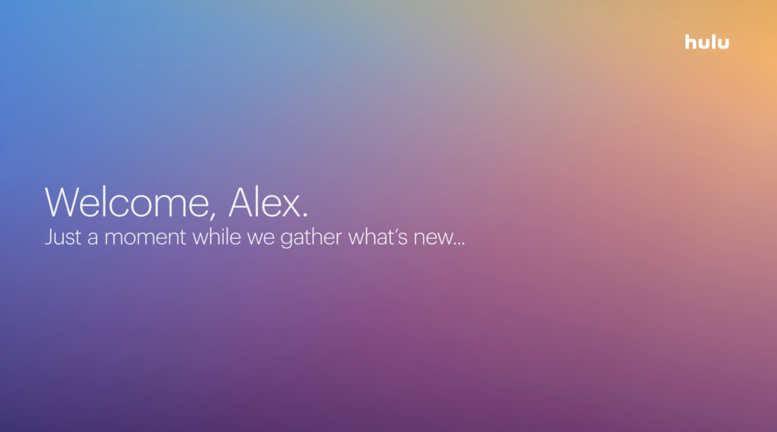
Additionally, making adjustments to the direction, proximity, and opacity of the stops within your gradients will help you better communicate the story within your colors. The Mesh tool in Illustrator is a great resource for designers as it allows for freeform customization of these elements, resulting in gradients that evoke the right emotion while looking handcrafted and wholly unique. Take a look at how Hulu and Spotify implement these principles to get pages that feel more like a watercolor painting than a computer-generated background.


3. Be Subtle
Keeping in the spirit of minimalism, less is often more with gradients. Exercising restraint in your colors and transitions can mean the difference between being obnoxious and sophisticated. Sometimes all that you need is a slight shade change to give your gradient the depth that it needs or a slight tint adjustment to imitate a light source, giving it a more grounded feeling.
In general, the flashier you are with gradients or the more you lean into the trend, the more you are tied to the temporality of that trend.
If you did a double-take at the Lyft app icon earlier you may have doubted if there was a gradient present at all. In fact, there is a gradient but it is ever so subtle. It presents Lyft’s brand color in a clear and consistent way but with an understated accent around the letterings and corners, resulting in a more visually engaging app icon that isn’t shouting for your attention.

Gradients are an incredible tool in our design toolbox, the trick is just to know when to reach for them and how to use them. Drop your thoughts in the comments below on how you have been using gradients recently and what tricks you’ve found to be most effective.
Can’t get enough of gradients? Check out these other great articles on UX Collective.
- Design Better Gradients — Dos And Don’ts by Nick Devashvili
- Design Better Gradients by Matthäus Niedoba

