
Google interaction design challenge tips
I have written my step by step design process and detailed the design choices I made during the process.
I spent 7 days completing this challenge, there are a lot of image references, so you can quickly scroll through if you like or if you are interested in reading full story, feel to read each line.

Music Space booking system👨🎤🎶🎻🎹🥁
A Google hiring manager sent me 3 different challenges. I picked this one because I thought it would be easy. It turned out to be difficult but it was still interesting 😅.
Challenge: Your school has built a new student center and is looking to you for some design expertise. Design the reservation experience for students, professors, and community members. They can check availability and reserve one of the music rehearsal spaces in the new center. Provide your overall process, a wireframe flow and 1–2 screens at higher fidelity.


Before jumping into the research phase, I stepped back and listed all the potential users of this reservation experience. Then I realized, there was a diverse set of users from ages 18–58 and they will use the system at different touch points.
Context:
I took SVA as a reference for this project. The work I did helped me to understand the reservation system they are using to manage appointments.


Then I talked to some people here and listed down all the issues they are facing in the current system and also the technologies available in the building.
Current Issues
The problems you think users may have are not always what they truly face.
Most of the time what we think will be the problem, will be different from real problem. A large part of the current issue is due to the lack of centralization of reservation system across the different departments. SVA has more than 30 departments and it’s difficult to merge all departments into a single reservation system. Each department has different Google forms.
User Research Questions
Ask twenty-four-hour why, you will win
A questionnaire was conducted on SVA’s students, professors, and lab members.
1. Which reservation system do you like the most currently?
2. How often do you book a spot in Music lab?
3. How often do you book a spot in the lab? When?
4. Do SVA faculty encourage you to check out the lab?
5. Did you book as a group or individual?
Synthesis of Research
Key sights from Music Rehearsal room
- Music rehearsal mostly happens as a group.
- Some instruments like piano or drums can’t move frequently.
Feeling and Thoughts of Humans
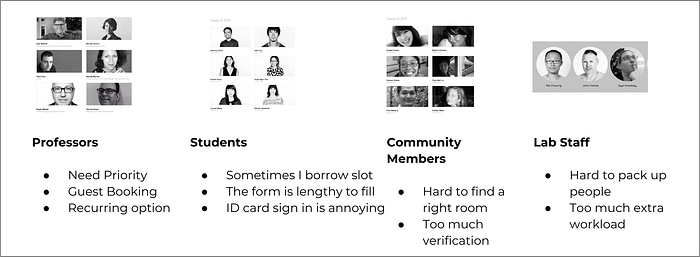
Pain Points of Students and Studio Admin
To build any system, first you have to understand their pain points.
Action words from research
Keep your ears open for the action words and their feelings
- Recurring booking
- Ability to Priority booking
- Way-finding
- Real-time update of slot availability
- History of booking (daily, weekly, monthly)
- Ask the user for his/her preferred time
- View trending events in new buildings

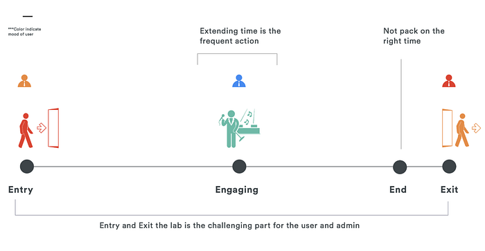
To memorize the pain-points, the requirements of each user, I drew a little story with a diagram so that I can easily remember. Also, everyone love stories, so during my interview, I can easily explain my design decisions with the story.
After drawing the story I found out core requirements of each user:
Student: Mobile Experience, Booking for multiple people
Professor: Website Experience, Booking for Music lab
Community Member: Kiosk Booking at the front desk
Touch points
Since the booking system involves humans, computers and college rules, I visualized how that would look and noted down what the touch points are.

Computer Touch Points
- Website
- Mobile-web
- Canvas (student dashboard)
- Kiosk
- Door lock
Human touch points
- Admin
- Maintenance
- Students
- Professors
- Community Members
System Level
While designing any system, we have to consider all of the system level things like what technologies are available now, how the new system will function after the work of the admins and whether we need to change any rules of the college as we introduce this system.


Blue and red Marker
Whenever I am drawing a user flow I use a blue marker to show the different use cases and red to show all the potential risks we may face.

Wireframes
During wire-framing, the core thing to remember is to focus the flow on visual detail.
Make wireframes you can understand and explain to others.
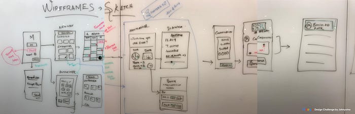
Low fidelity wireframe
Instead of directly jumping to visuals, first, fit the basic layout in the user flow. If you are not an expert in prototyping, just use a green marker to define the flow and hand gestures.
“Try to include the screens outside of your app too, to give context to the listener”.


“Don’t be biased by famous colors.”
This is the main advice I give to myself and others. Don’t just copy other apps using a certain color scheme or just using colors like blue and pink.
Go to the actual field and try to take as many pictures as possible. Don’t just look at the colors, understand the emotion and energy around that place.

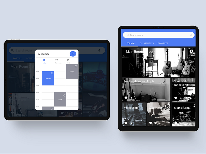
UI Design
Since the design is for Google, I have used all the basic material design styles so that they can easily relate. I know the color looks ugly, but this perfectly goes into the classical music style.

HOME SCREEN
The home screen has image representation because most of the club members want to know how things look so that they can fit their equipment. Also, include the number of people that space can accommodate.

CALENDAR
V1: Offer users with the available slots
V2: Ask the user preference then showcase the available rooms.
After 2 months later I looked back the design it looks super ugly to me so I redesigned it again.

“Only 60% of your work is done when you export your design to Zeplin. You have to work with your developer to verify the quality of development and impact you made.”
While making any decision, you must consider all the costs you created and what risk this system will create in the overall project.
Potential Risks
- Unfulfilled/False booking
- Sign-in door problems
- Inaccurate number of people entering.
- Unknown person entry
- Multiple booking on the same person name.
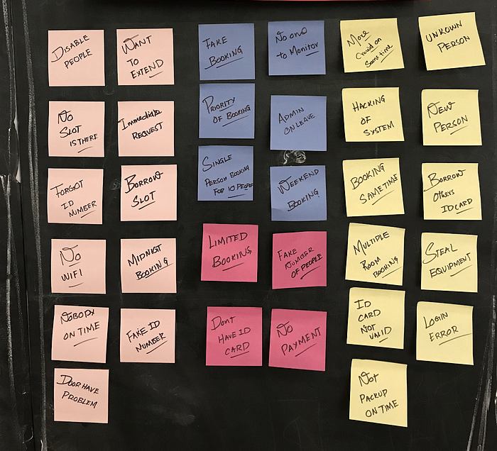
Edge cases to Consider
Support booking for disabled people.
- Priority in the booking system.
- Forgot ID card.
- Immediate request.
- Admin on leave.
Takeaways
- Spent too much time on research than the actual design. Next time I have to balance.
- Storyboarding is super-helpful to understand all the use cases.
- Forgot to showcase my core skills: micro-interactions, animation, UI.
- You can use Quicktime screen recording to record your process.
Thanks to Corey Waldin for revising drafts of this post. 🙏
Recommended articles for you
- UI/UX case study for the New York Times app
- 11 Things every designer Needs To Know About Mobile App Interaction.
- Why is UX/UI designer the best job in the world?
- The Secret of Successful UX Writers
- 5 Motivational Tips for Designers
- Lesson for Young designer from Elder Designers
Available for new design projects
Email: contact@johnyvino.com | Portfolio: johnyvino.com/interactions

