How Letter Casing Affects Comprehension of UI Content
What is your earliest memory of reading? Mine’s reading comics. I preferred films over books, I still do, but I seemed to have a fascination for comics. The experience of reading a comic, to me, was somewhere between watching a film and reading a novel, between audio-visual and pure text.
I recently realized that the text in comics is always uppercased. If you haven’t noticed, here you go:

As an avid reader of comics, the 10-year-old me was always in a dilemma about capitalization. Should I use upper case just like in the comics or should I be doing what I am taught at school? As it turned out, my teachers at school weren’t big fans of comics, so I had no choice but to listen to them.
Fast forward to 2019, I was an editorial intern at Juggernaut, a publication house. During my time there, I was asked to master the Chicago Manual of Style, which was used to format Juggernaut’s books. And capitalization was one of the core elements of style that I had to learn up about.
I have been a UX Writer at Chargebee since July 2019.
While working on all the various projects that have come my way, I have been instinctively obsessed with the capitalization. So much so that my colleagues soon began to take notice of my obsession and were curious to know why it mattered so much.
This is my attempt at trying to answer their question. Let’s start with the basics.
What are Letter Cases?
To quote Wikipedia,
Letter case is the distinction between the letters that are in larger upper case (formally called majuscule) and smaller lower case (formally called minuscule) in the written representation of certain languages.

Why and When to Use Them
Letter casing is used in screenplays, novels, comics, magazines, and anywhere there’s text.
Here’s a peek into the screenplay of Christopher Nolan’s Interstellar (2014):

Notice how the descriptions are written in sentence-case, while the characters’ names are in upper-case, and the parentheticals are in lower-case. This difference in capitalization helps the reader comprehend text elements as locations, descriptions, characters, dialogues, etc. Read more
So you can see that letter-casing is
a systematic use of capitalization to aid readers’ comprehension of content.
Why Letter Casing Matters in UX Writing?
Different writers capitalize differently. However, it is important that organizations set up standard practices around how the various styles of capitalization are used.
Most Popular Letter Cases
- Upper case — CAPITALIZE EVERY LETTER.
- Title case — Capitalize the First Letter of Every Word in a Sentence Except the Articles (a, an, the), Conjunctions (and, but, or), and Propositions (on, in, with).
- Sentence case — Capitalize only the first letter of a sentence and the proper nouns.
Other letter cases such as the camel case (SaaS), though interesting, aren’t commonly used in UX writing.
Upper Case (aka ‘All caps’)
Our eyes are quick to spot words in UPPER CASE as our minds are trained to perceive them as important pieces of information.
For example, in Chargebee, when a subscription is set to cancel, we must notify our users (the merchants) as they would want to reach out to the customer and understand why they are canceling. In other words, we need to make sure that our customers do not miss on a subscription that’s about to cancel.
So we decided to use upper case for the tag ‘CANCELS IN 12 DAYS’ on the subscription’s page.

Title Case
The title case helps to bring a hierarchy between text elements in a write-up or on a page, such as titles and descriptions. As a reader, I find it easier to consume content that’s well-formatted, in good order, and hierarchically well-laid out. I find such pages super easy to skim through.
For example, this is a reconfirmation message shown to customers when they are deleting a shipping address. The title is written in the title case and the description is written in sentence case. Ignore the buttons for now.
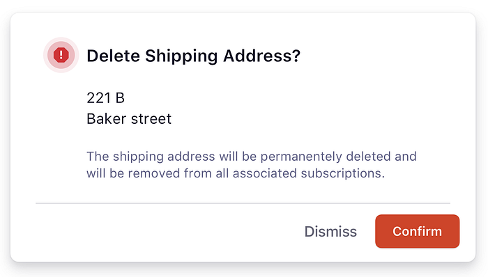
By using the title case for the title, we have tried to establish the hierarchy that we want our users to follow.
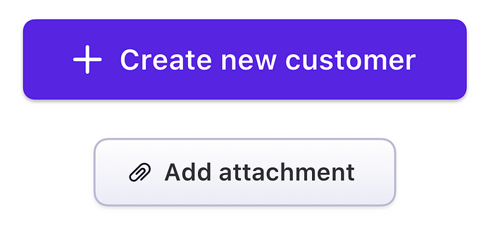
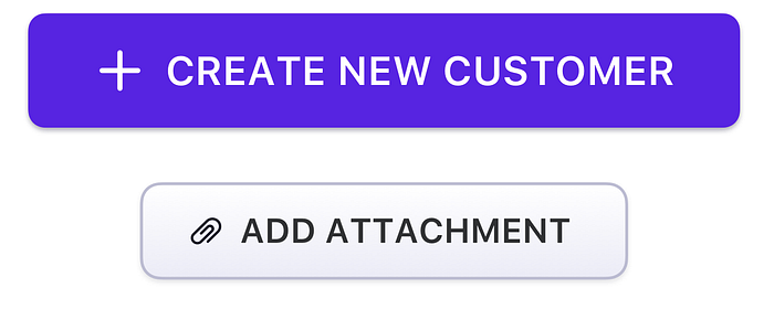
The title case is also a great choice for buttons. Let me illustrate.
Here are two buttons in the sentence case. Too low on emphasis, I think.
How about upper case? Screaming!
Now, the same buttons in title case.
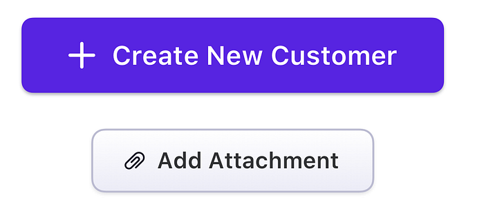
I think title case brings just the right amount of emphasis on buttons.
Sentence Case
In sentence case, the first letter of a sentence and the proper nouns capitalized. It’s considered the most readable form of text. Capitalizing the first letter of a sentence serves almost the same purpose as a period (.) at the end of every sentence — to convey the end of a sentence and the beginning of another.
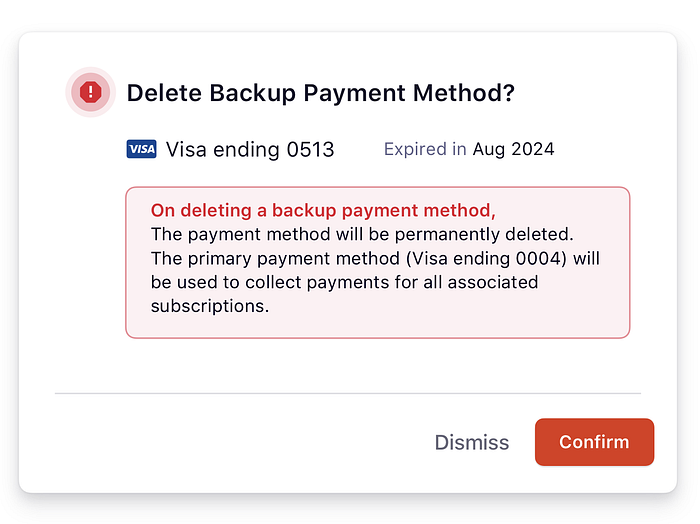
At Chargebee, we use sentence case for descriptions and when need to get into the details. We have, in the example below, used sentence case to explain what happens when a backup payment method is deleted.
Now, let’s look at the same bit of copy without sentence casing and the period.
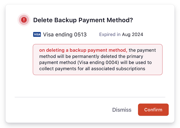
Are you thinking what I am thinking?
Reading is easier when you’re able to break down copy into parts. This experience is further enhanced with the use of appropriate punctuation and effective capitalization.
Also, the sentence case spotlights proper-nouns nicely.
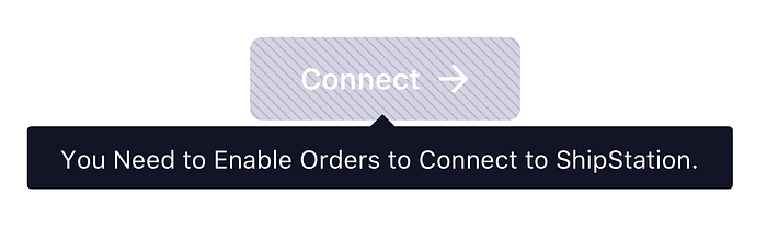
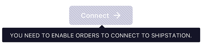
Let’s look at an example. Here’s a tooltip we show users to inform them that they need to enable Orders (a feature in Chargebee) before they integrate with ShipStation.
Here’s the tooltip in title case.
The same tooltip in upper case.
And finally, in sentence case.
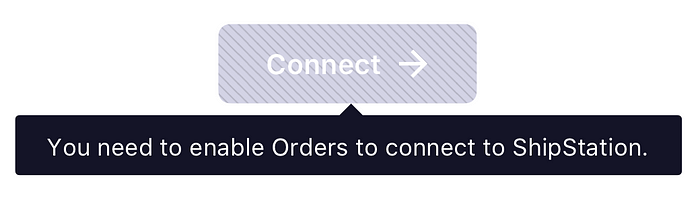
Notice how in both upper case and title case, the proper nouns in the sentence (Orders and ShipStation) are lost amidst all the other words. Users may not understand that “Orders” is the name of the feature that they need to enable. When the same line is written in sentence case, notice how the proper nouns are capitalized thereby making it easier for folks to understand that Orders is the name of a feature in Chargebee and ShipStation is the name of the third-party application they are looking to integrate with.
Why Comics Use Upper Case Text?
I Googled this and here’s what I found out:
Typing in all capital letters is acceptable for comics, and it’s pretty interesting why. In real comics, they use all caps all the time. The reason for this is that some lower case letters (like j and y) have tails that fall below where the bottom of the letters are supposed to be. The comics industry knew they could avoid this by using all uppercase. The point of doing this is to make the word balloons take up as little space as possible, and keeping everything in caps does just that. Read more
So why wasn’t I conscious of all that upper case text in the comics I read as a child?
Conditioning. My mind got conditioned to perceive text elements in a particular way. Perhaps it had to do with the fact that I treated all the capitalized text as dialogues of characters, and thought, maybe, that it was meant to make the superheroes sound powerful. Only when I started reading novels, years later, did I realize that dialogues could be written in sentence-case too.
Form Compliments Function, More Observations
I observed that on the PVR Cinemas app a film’s title and language are written in all caps. Initially, I wondered why. At first, I thought, because the primary information on a movie-ticket-booking app would be the movie titles and their languages.
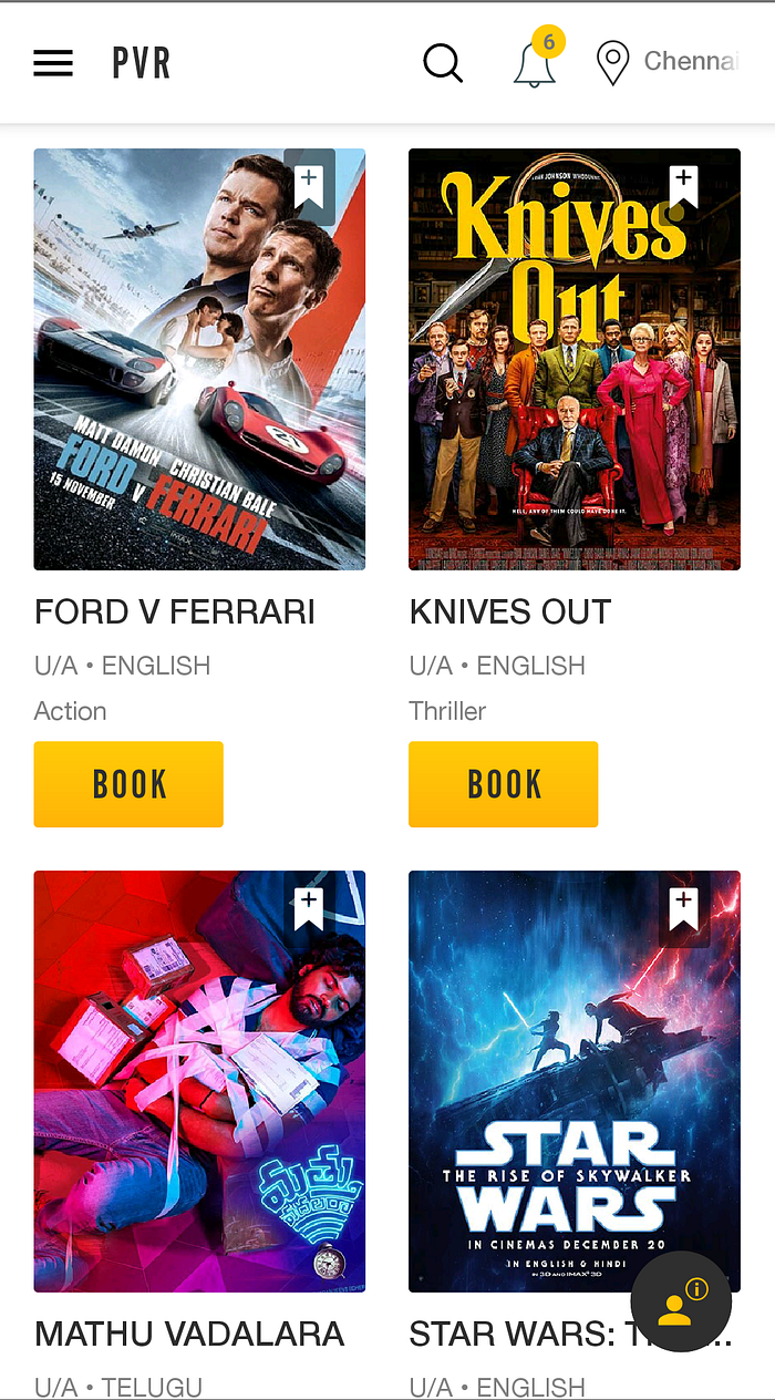
But I think there’s more reasoning to the decision than just prioritization of the primary information. And it has to do with user experience. I realized that upper case for titles and languages made skimming while scrolling easier and helped me find what I was looking for much sooner. You know how words can sometimes just feel blurry while scrolling, right? Well, the text in all caps did not. Voila!
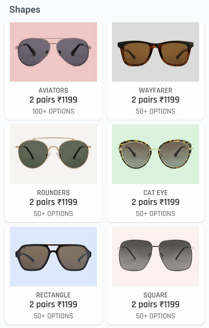
A similar observation on the Lenskart app
Once you see this screen, you will instantly learn the pattern
- The name of the frame is upper cased.
- The quantity and price are sentence cased.
- The number of options is upper cased.
The pattern is easy to grasp and once we’ve gotten used to it, using the app becomes easier.
So Why Assign Letter Case to Content?
- To establish a hierarchy in the flow of information.
- To condition users’ minds to perceive copy in specific ways.
Capitalization is a tool in UX writing to improve comprehension and consistency of text elements. Thus, needs to be given due importance.
Our mind is always looking for patterns, even on digital interfaces. When users consistently view upper cased text as important, sentence cased text for descriptions, they learn the pattern. Of course, consistency matters and it is important for writers to keep capitalization across the medium consistent.
At Chargebee, our Content Style Guide defines capitalization rules for various hierarchical elements for copy. These guidelines are followed by all the UX writers when creating copy for the Chargebee app.
Note: All examples, opinions in this article are purely my observations and learnings. If you’ve been involved with writing copy for any of the apps I have mentioned above and would like to share your thoughts, write to me!
Thanks to my fellow UX writers at Chargebee, Tara Rachel Thomas and Rohit Nair, for helping me best articulate my thoughts in this article.