Member-only story
How Singapore paid millions to make its logo bigger
Not just literally, but also atmospherically.

This issue of Creative Monologue presents my curiosity about the evolution of the Singapore mark, from its early development as a jubilee logo, to its cemented presence under the tourism board. Why did they make the mark larger than life, and why can that be bad? There’s a lot to dig through, so let’s discover and talk about it.
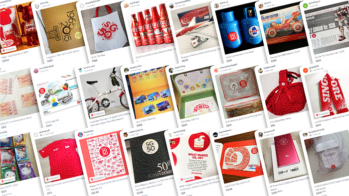
Singapore is a small country with big dreams. You can say the same about its logo. Despite the country being termed as the ‘Little Red Dot,’ you’re most likely presented with the Singapore mark in a bigger size on prints and advertisements. It is part of a joint effort by the Singapore Tourism Board (STB) and Economic Development Board (ETB) to promote itself to other countries.
The mark is simple-looking, being just the country’s initials in a circle. But that simplicity was offset by the maximalist attempt to disseminate the mark on every visual media the government had its hands on. Let’s see why it has become that way, how such a branding remains unclear, and how it can go wrong.

The Jubilee Logo Manifesto
Before the Singapore mark reached the hands of the boards, it was the Ministry of Culture, Community, and Youth (MCCY) who had first dibs. Ideas of what would take place during the country’s jubilee were done two years in advance. They got in touch with a local creative agency, Black, to promote the nation’s celebration with a logo after they won a bid to do so. Black’s Creative Director, Jackson Tan, turned in a design that has a valid rationale. It is a solid red circle (a homage to the Little Red Dot) containing four characters, ‘SG50.’ They were arranged neatly, with two adjacent characters each seating above and below the other. It is based on Milton Glaser’s I❤️NY mark, as proudly declared by Tan. Gotham, a typical geometric sans-serif, was also the font of choice. The logo has a benign look, with seemingly no risky elements or radical design choices being used.

