You're reading for free via Faux Icing's Friend Link. Become a member to access the best of Medium.
Member-only story
How Singapore paid millions to make its logo bigger
Not just literally, but also atmospherically.

This issue of Creative Monologue presents my curiosity about the evolution of the Singapore mark, from its early development as a jubilee logo, to its cemented presence under the tourism board. Why did they make the mark larger than life, and why can that be bad? There’s a lot to dig through, so let’s discover and talk about it.
Singapore is a small country with big dreams. You can say the same about its logo. Despite the country being termed as the ‘Little Red Dot,’ you’re most likely presented with the Singapore mark in a bigger size on prints and advertisements. It is part of a joint effort by the Singapore Tourism Board (STB) and Economic Development Board (ETB) to promote itself to other countries.
The mark is simple-looking, being just the country’s initials in a circle. But that simplicity was offset by the maximalist attempt to disseminate the mark on every visual media the government had its hands on. Let’s see why it has become that way, how such a branding remains unclear, and how it can go wrong.

The Jubilee Logo Manifesto
Before the Singapore mark reached the hands of the boards, it was the Ministry of Culture, Community, and Youth (MCCY) who had first dibs. Ideas of what would take place during the country’s jubilee were done two years in advance. They got in touch with a local creative agency, Black, to promote the nation’s celebration with a logo after they won a bid to do so. Black’s Creative Director, Jackson Tan, turned in a design that has a valid rationale. It is a solid red circle (a homage to the Little Red Dot) containing four characters, ‘SG50.’ They were arranged neatly, with two adjacent characters each seating above and below the other. It is based on Milton Glaser’s I❤️NY mark, as proudly declared by Tan. Gotham, a typical geometric sans-serif, was also the font of choice. The logo has a benign look, with seemingly no risky elements or radical design choices being used.
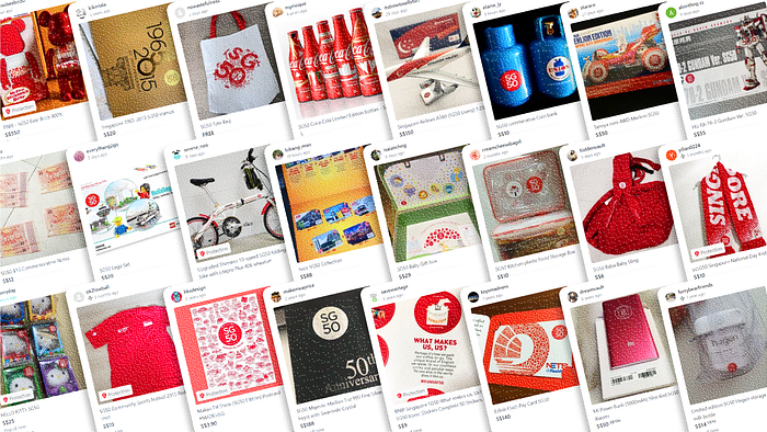
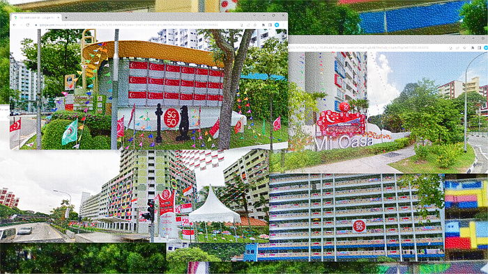
What was radical, however, was the way they wanted to advertise the logo at the start. A closer look into the branding guidelines (first publicly revealed in January 2014) shows the many ways that the logo can be used. Beyond stickers and apparel, it is encouraged for the mark to be plastered on every ordinary object, building, and vehicle, and even made into a “giant art installation.” This was not a mere suggestion, for the government actually funded an estimated nine million dollars, other than the events themselves, to get the jubilee decorations to the state it was in. This overshoots the initial budget of five million, almost double its original decision. An additional fifteen million dollars was dedicated to just National Day celebrations itself, which without a doubt has its mark all over the place.

In living up to the vision, what the project has funded includes events that revolve around the idea of making huge SG50 logos with smaller elements. There is one made up of umbrellas, another of badges, and even one consisting of jelly worms. The ample time of almost one whole year allowed many to put their (hot) takes on celebrating the jubilee. Fishcakes were also not left out of the equation, as documented by multimedia artist Johnson Zhang in his blog, lamenting about the omnipresence of the logo during that year. With the number of impressions SG50 was getting, it was doubtlessly ingrained into the minds of citizens that the country is fifty years old, and also very pervasive.

After the 50th Year
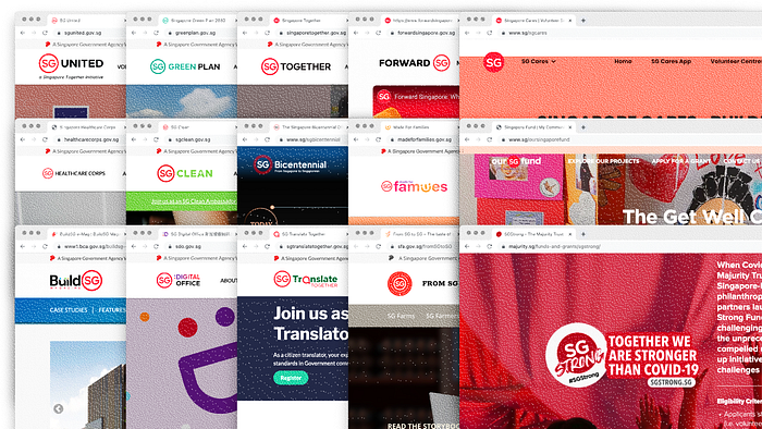
Things didn’t just end there for the tiny/big, red, circular logo. Upon further collaboration with PR agency Ogilvy, MCCY and Black later converted the logo to only encompass the initials of Singapore. It is now used ubiquitously as a companion to any local initiatives, such as Our Singapore Fund, The Majurity Trust (SG Strong Fund), and the national movement SG Cares. 2016 marks the transition of the logo to exist more in the digital realm, as these local initiatives are now developed with an online presence in mind with the aid of the country’s Government Technology Agency (GovTech) set up that year. Websites and social media accounts were created to aid in the publicity of these initiatives, which became especially useful when COVID-19 hit worldwide by the start of 2020.
The journey to go digital is in line with Prime Minister Lee Hsien Loong’s aim to help the country adapt itself as a “Smart Nation,” an island where “people live meaningful and fulfilled lives, enabled seamlessly by technology.” This shift however did not, and probably will not match the infiltration of the logo as much as the jubilee did. After all, the logo was mostly used by the MCCY at this point in time, and it’s not mandated for any other government bodies to use them. However, with efforts by the boards, the logo wasn’t going to remain in this state.
Here Comes Tourism, and More
While creative agency Black lacks involvement in this, the Singapore mark introduced by STB and EDB (in August 2017) is based on the logo they commissioned for MCCY. The boards, with the help of The Secret Little Agency (TSLA), converted the logo in imitation of a stamped seal by turning the circle into an outline, leaving the ‘SG’ initial in a red hue as well. They opted for another sans serif type that has slightly rounded ends.
So where are they going to stamp the mark? The answer is, of course, everything Singaporean. But not in an SG50 fashion. The boards have intended their tourism rebrand to be done in a holistic approach, such that it can be utilised in drawing foreign investors, amplifying the voice of citizens, and uniting the narratives of government agencies. This means your tourism advertising, local initiatives (as mentioned) and government-backed campaigns are going to be seen with a mark on them. That’s a lot of marks to go around, and it’s showing. You now have SG Clean, SG Digital Office, SG Together, SG Made for Families, and the list goes on. Realised how they all have a website? And it’s not just websites and social media.
In 2019, the Housing Development Board (HDB) made a decision to roll out 6000 digital display panels situated in lifts and lobbies of housing flats. These panels are meant for displaying local notices and government-related announcements. While commercial advertisements are included, their presence will not exceed “30 per cent of the total screen time.” This means there is up to a 70% chance that the display panel will show a resident an announcement or notice that’s by the locals or government, and yes, with a Singapore mark on it. The panels were said to cost around $650 each. And having a total of 18,100 being installed (as of 2022), this means more than $11.7 million were spent on them, excluding installation fees.
There are funds yet to be calculated, like their budget for the 2017 tourism campaign which they kept mum about, and the cost of printing all the different collaterals that included their mark. But it’s safe to say that things would have amounted to more millions when we take a look at how much STB invested in their previous campaigns. For example, they spent $20m on advertising the Great Singapore Sale to foreigners in 2015, and $45m on domestic tourism marketing in 2020.

It’s Everywhere, But at What Cost?
As a person living in Singapore, I am saturated by the marks in public spaces. I can’t go about my life without seeing it at least once, be it in a lift landing, hawker centre, community club, or library. It’s on banners, decals, standees, posters, pamphlets, and even machines, because of the electronic tokens that the government issued during COVID-19 for contact tracing.
Having the Singapore mark being placed everywhere around the country, to me, kind of feels like how new startups enjoy branding themselves by printing their logos and identities on every object. However, Singapore is not a company, but they are advertising like one. Alywin Chew, a Senior Editor at China Daily, comments that the collaboration between the STB and EDB for the tourism campaign “seems to validate the notion of Singapore being no different from an enterprise.”
It may be an enthusiastic attempt from the government to brand its country thoroughly, attempting to stand out from competitors to rake in fatter tourism receipts. But this strategy also causes the identity of the country to blur. Reviewers have criticised how the campaign videos whizz past every aspect of Singaporean culture that one can’t properly grasp any particular subject. You end the video feeling nothing distinctive about the country. The Singapore mark does the same thing on its tourism posters. It’s plastered on food, hobbies, nature, and buildings. It thus creates a certain conflict, where the country is selling itself, but what it exactly sells is left in question.
TSLA additionally won this bid to do their branding, however with a caveat. Despite having worked with the EDB since 2010, their relationship with the local authorities was not always great. Two separate clients whom they worked with have caused them to be involved with the police, the reason being that they could’ve been “rioting and being a public nuisance.” TSLA founder, Nicholas Ye, however, notes the lack of local laws surrounding creative expression that has resulted in such disputes.
With that said, it is not surprising to see why Ye would choose to not take more risks with the statutory boards when it comes to working on their brand. This may have contributed to the overgeneralisation of the campaign, thus leading the mark to be stamped according to how the boards would’ve wanted it: everywhere.

The Impact and Dangers
Unlike the in-your-face prevalence of the jubilee’s ‘SG50’ logo, the Singapore mark is subtler in its omnipresence. They aren’t printed in large sizes as much, relegated to the little corners of screens and prints to indicate an announcement from the government. It thus lives up to its use of being an official mark. I can’t help but think, isn’t this also potentially conditioning citizens, that such a mark means the authenticity of an authority? Can using the mark to also scam people be a possibility?
Data from the Singapore Police Force have shown that there is an increase in the number of phishing cases and money swindled in the first half of 2022 as compared to the previous year, amounting to several millions of dollars. Such scams include text messages and emails from criminal groups pretending to be government agencies, requiring victims’ sensitive data to resolve false issues. Such spoofing has also affected the donation platform, Giving.sg, informing people of the need for vigilance.
The mark, although not as significant in the scheme of things, can still be used as an additional tool to fool vulnerable ones into believing the genuineness of a message coming from a government agency. It is also not as hard to fabricate an entire website pretending to be a new Singaporean initiative whilst using the mark in their logo, considering how the Singapore Government Design System (SGDS) is open-sourced. For users to be tricked by scammers in this case is a likelihood.

Conclusion
My head got spun researching and looking at the marks repeatedly, but these are the thoughts that I have about all this. To brand a country like a company is just as strange as a man branding like a large firm. Both are overselling. Both become indiscernible as to who they really are and indistinguishable from their competitors.
The boards may stick with this brand for some time, now that they have gone so deep, and gotten so much mileage in its use since the original design back in 2015. Whether or not they’d refresh the mark again (not as one-off as the Bicentennial) or reduce its reproduction in another couple of years, we will have to see as time goes by.
It’s fascinating how Singapore’s obsession with the little red dot has manifested and evolved into what it is now. Yet, there’s still more to do for their branding if they want the mark to work efficiently and prevent it from becoming a use for deception.
Welp. I hope I haven’t given new ideas to scammers already.


