Part 1
Little details in UX design: Tabs vs. Accordions

Accordion v/s Tabs — When to use what while designing kick-ass UX!
Hello there! 😎
I am thinking to start a series of stories about very small, insignificant looking (but important, huge and relevant) features in design, that can make or break a kick-ass experience for the user! I have in mind a series of things to compare, experiment and finally write about, and the first part of the series is —
Tabs v/s Accordions
Tabs or Tiles (but in this story I will refer to them as tabs) are the most common way to present sections and categories in a design system, from where you can select an option to change the data that is displayed on the screen. The data in a way, is being fetched from the tabs on the top. So, the tabs become first choice of the user to see the data that they wish to.
Accordion on the other hand, is an equally popular way of presenting data on a screen. The only difference between a tab and an accordion is that tabs are horizontally aligned while accordions are vertically stacked, one on top of the other. While tabs do not interfere with the data of other tabs, accordions do.
But both tabs and accordions serve their own purposes beautifully! There are many amazing websites that use tabs, and many that use accordions and they are all beautiful in their own ways. But when it comes to a design challenge, how do you decide what to use and what not to?
Before you jump to the conclusion and decide what to use, and what to avoid, ask yourself — WHY do you want to use this, as well as WHY NOT the other option?
Design thinking after all is nothing, but human centred approach to problem-solving, with a tinge of common-sense. Many designers — just to make things look and feel fancy — forget about common-sense, and forget that the users that they’re targeting are not fellow designers, but real people of the real world!
They are the real people, who might be doing a typical 9 to 5 job, juggling numbers in a bank, or a college student who has no time to look at a fancy app. Their purpose of using the website or the app is to get shit done. And if their purpose is not being met, the entire logic of them using your app or choosing your website among hundreds of others, is defied. And that is where the user decides to turn around, and never return to this app/website again. And once you’ve lost the trust of the user, it is pretty much permanent!
Hence, before you decide to go with any option, divide a piece of paper into two parts, and write — WHY | WHY NOT. Under these segregated sections, start jotting down points to support your decision.
Now, here in this story, I will present a scenario, a design challenge, around which I will discuss why you should use tabs, and why you should choose accordions, and under what circumstances?
WHEN THERE ARE LIMITED OPTIONS/CATEGORIES (5 to 7)
When the number of options is limited, that is ranging from 5 to 7 (maximum) —


If your content changes only in a specific area of the website, then you can use both Tabs and Accordions (depending upon the structure and architecture that the rest of your website is using). Like in the image above, you can see clearly that the change in data is evident from change in categories selected through tabs.
WHEN THERE ARE TOO MANY OPTIONS (More than 7)
When the number of options is more, or in case the design is expandable in future, in that case using an Accordion is a BAD option, and this is why —

Another problem with Accordions is that they cause a sudden UI-shift. Suppose if the user is reading something from this section —
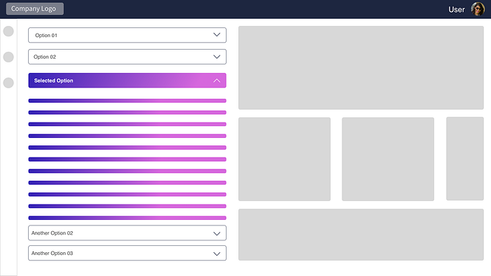
Now, I’m reading something in accordion option-03, and when I move on to option four, I have already reached almost the bottom of the page. That’s where my sight currently is, because that’s where I see the other accordion named ‘Another Option 02’, and now when I click on that accordion, this is what happens —
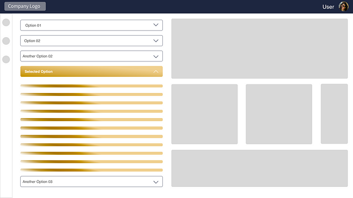
You see what happened? Not only did the opened accordion closed, but the option that I selected opened and shifted to the top, while my sight is still at the bottom. I feel deceived!
Hence, in such cases, you can use Tabs and wrap them in two rows if they don’t fit in one —
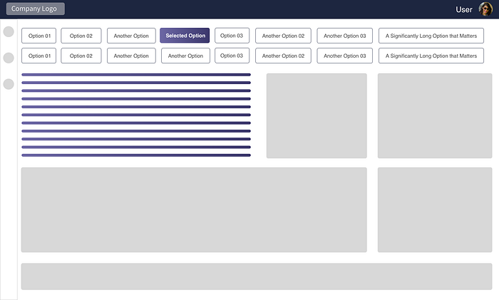
Since, vertically we have only a limited space in the viewport while there’s significantly more space available horizontally, so whenever you’re in a dilemma of whether to use Tabs or Accordions, keep these things in mind.
Some more options that influence your choice of Tabs v/s Accordions could be —
- How much data you have under each section? If you have only 3–4 categories, but the data is way too much, then there are chances that accordions might be a bad option to use, as you can’t see both — categories and data in one viewport. You will have to add a scroll for the user. Hence, in case of more data but limited options, you should consider using Tabs! Also, with tabs you can ‘freeze them in a top-bar’ for a continuous accessibility and add as much data underneath as you wish to!
- What is the architecture that your website is following throughout, on every page? This question will give you a clarity on whether you should use tabs or accordions. If your website has vertical navigation throughout, you should go with accordions to keep the pattern same, and to keep the user comfortable throughout the website (but again, after considering other factors as well).
- What is the length of your categories/options? If they’re too long, then accordions are a better choice rather than tabs! Accordions placed on a horizontal space have too much space to accommodate long options and plenty of data, while on tabs if you choose long names as labels, they will look more or less like accordions only! For example, in case of FAQ sections, using tabs would be a BAD idea! You can freely use accordions there, and show all questions clearly to the user.
These are just some of the examples where you can consider using tabs or accordions. At last, as a UX Professional, you must always question every decision of yours with a subtle “WHY?” Ask yourself ‘why-not’ or ‘why’ do you want to take this particular decision for your design? And you will find that clarity that you’re seeking!
That’s all for now, let’s keep contributing, sharing and adding wonderful ideas and stories here, and make this community awesome 😎
Part 1 (Tabs v/s Accordions) — You are here!
Part 4 (Developing a Design System)
Part 5 (Dimensions and Sizes in Interfaces)
Part 6 (What comes first — content or design?)
Part 7 (Designing Landing Pages)
Part 8 (Practicing Patience and Contentment)
Part 9 (Get to know your users — not through Surveys and Interviews)
Part 10 (Designing in parts and pieces, story-telling & emotions in digital products!)


