
Redesigning the macOS desktop experience
This story is part of a serie that focuses on improving the user experience on existing platforms. The last one was about Youtube and can be found here. This one is about macOS.
I love the Mac. When I first experienced it when I was in high school, I instantly fell in love with it. I loved going to my aunt’s house because they had a huge iMac (the 27-inch) in the living room and I could spend the whole afternoon on it (of course, I love my aunt too). Just surfing on the web with it was a totally different experience from what I was used to. It was all about the astonishing graphics and sleek user experience. After that, I convinced my family to switch to the Mac, and we have stuck to it ever since then. Looking back on it, I think this is where my sensitivity as UI-UX designer truly started to reveal itself.

When Apple introduced the multi-touch gestures on the trackpad, I thought it was pure genius. The gestures were complementary to the fullscreen mode, inspired by iOS: we could instantly go from one desktop/fullscreen app to another with a 4-finger-swipe on the trackpad and it felt so damn good.
Having spent 5 years or more with this feature (I actually can’t remember of a time where it wasn’t there…), I have grown to think that maybe we could build on it to make the overall macOS experience even better. This is my attempt at doing so, and it’s called macOS Newton.
Note: this concept focuses solely on the overall user experience, and not on the look and feel of macOS apps. This is another subject I would gladly come back to in a near future, but for the moment, I thought it would distract people to introduce a new visual style on top of the new experience. Also, for maximum clarity, I decided to use empty backgrounds on the images.
Windows are dead (update: almost)
Windows were great back in the 80s, but they don’t feel relevant anymore in the post-iPhone era. When I work on my Macbook Pro, I never use my apps in window mode, I always go fullscreen. It helps me organize my workflow, optimize readibility and it feels more natural to go from one app to another thanks to the 4-finger-swipe on the trackpad. When my apps are fullscreen, I know where they are in my digital space, I only need swiping to them to get where I want. Using windows is a whole different story.
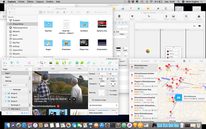
And when I work on my Mac, I typically use 6 or more apps at the same time; this screenshot is not that eccentric at all.
What I propose instead is something called Flows: it’s easy-to-use, designed for multitasking, based on natural gestures like drag-and-drop or swiping, and explicits the spatial organization of the desktop.
Flows
Opening an app
First things first. Let’s try to open an app in macOS Newton.

Safari goes directly in fullscreen mode. Notice how I swapped all the Mac icons for their iOS peers. That’s a matter of personal taste, but I like regularity and coherence across all the ecosystem. The dock and the opening animation have also been inspired by the iPad.
Now, in order to make things very clear until the end of this story, I will use the following nomenclature:

Having fullscreen automatically activated saves us a lot of time, instead of the current two-step process where we need to open the app first and then click on the green button.
A few other things happen here, but I’m keeping them for later. Now, let’s open a second app to understand the concept of Flow.
Opening two apps (and more)

The Dock is summoned with a 4-finger-swipe halfway up through the trackpad (the old gesture of placing the mouse at the bottom of the screen still works in macOS Newton). When Photos was launched, Safari — which was the first opened app — shifted to the right to leave space for Photos to position itself on the left of the screen. In macOS Newton, apps get stacked linearly, with the most recent one on the extreme left of the Flow. Users can add as many apps as they want in the Flow, and place them at a particular position with a simple drag-and-drop:

Normally, when apps are opened, the Dock gets closed. However, small detail, if the cmd key is pressed, multiple apps can be launched without closing the Dock; a lock appears on the Dock in that case:

To scroll through the Flow, scroll horizontally with 3 fingers on the trackpad.

Of course, it is also possible to change the width of the windows, by dragging left or right the black bar that separates them. Magnetic anchors help position it at specific places, like the middle of the screen, and give users the possibility to activate Split View (two apps fully visible onscreen):
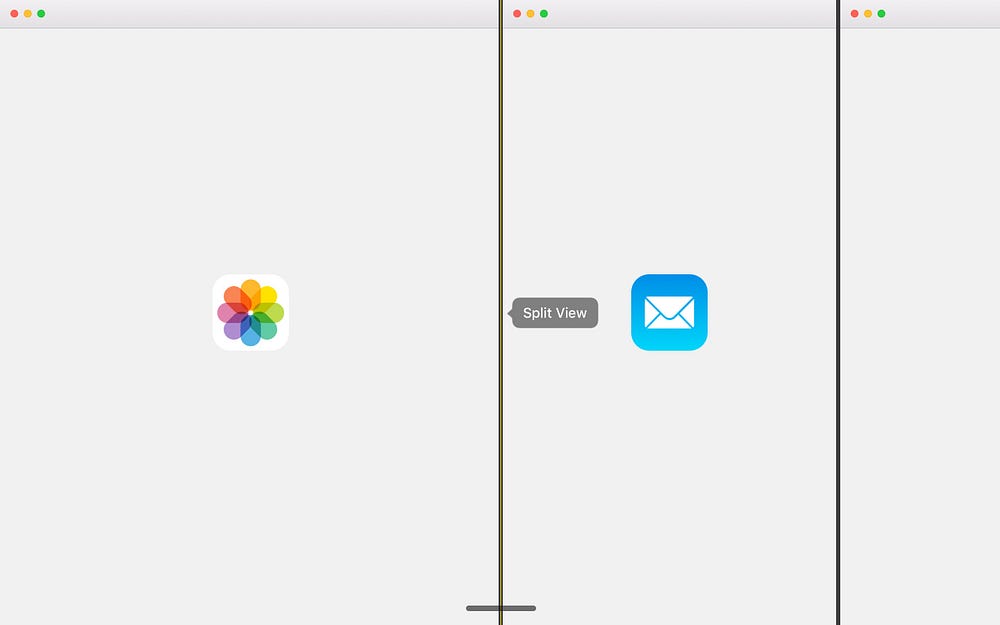
Before macOS Newton, to obtain a similar view (Split View), I had to first open both apps I wanted to have in front of me, long-click the green button on one of these, and finally select the other app. It required too much thinking beforehand, and was not very easy to do. No wonder have I never used it, although it could have proved very useful in so many cases. I think a lot of Mac users are not even aware that they can do it.

In macOS Newton, this process is completely simplified as it is automated and more natural and puts multitasking at the heart of the macOS experience.
Update Note: With the feedback I received, I decided to update the concept slightly. When you open apps, they still launch in window mode. However, you can arrange them in a Flow by swiping down on the trackpad with 4 fingers; the most recent app will be on the left of the screen. For non-trackpad users, a keyboard shortcut or a 2-finger down swipe on the Magic Mouse will do it. I will show you what it looks like with a nice animation next week. :)
The Flow Strip
This is the essence of this concept. Did you notice what happened when I opened Photos in the previous part? Let’s rewind a bit and look carefully.

That black bar at the top of the Dock is called the Flow Strip. There are so many features associated to it, I can’t wait to dwelve into them with you.
The Flow Strip is essentially an overview of the apps that are sitting in the Flows. When using apps, the Flow Strip shrinks down to a simple bar that sits at the bottom of the screen; it fades away after a few seconds. To open it, I just need to hover the lower part of the screen with the mouse.
Apps’ instances (windows) are represented there as dark rectangles, with the name of the app on it, so as not to confuse the Flow Strip with the Dock. Currently visible apps are more opaque than the rest. With this representation, users have a clear representation of what they have open on their Mac. From there, they can also easily rearrange the Flow by simply dragging the dark rectangles to where they want:

They can quickly go to the desired opened app with a click:

Users can also quickly delete instances they don’t need by entering edit mode with a long click.

Finally, they can drag their apps directly in the Flow Strip to position them at a specific place in the Flow:

So, that’s a roundup of all the things you can do with the Flow Strip. Have I mentioned that the Flow Strip is also available in the Touch Bar?
In fact, the Touch Bar was where the Flow Strip came from in the first place. I was trying to come up with a new productive way of using the Touch Bar, and the Flow Strip was how I imagined it. For the first time ever on a Mac, you would have been able to control your windows with your finger. Then I thought that making it available only in the Touch Bar would most likely be too restrictive for a lot of Mac users, and that’s how I ended up with the concept above.
Work scenarios
A Flow is the digital metaphor of a work scenario: to perform a task, we typically use more than just one app, and all the apps contribute to the same goal. In my case for instance, when I write story scripts, I open Pages to write, Safari to look for things on the web or get inspired, and iTunes to listen to music; these 3 apps altogether are associated to me writing, but they can also be used individually in other scenarios. That’s how I came up with the idea of saving Flows.
Long-clicking an element in the Flow Strip will open the edit menu, in which it is possible to save the Flow for later uses.

There is also a dedicated section in the settings, in which I can create and manage my own personalised Flows, thanks to an intuitive UI-UX based on drag-and-drop gestures.

The last actions that were performed in each app are listed on the left column. On the right, I can create as many personalised Flows as I want, and drag the actions from the left directly in there, in the order I desire. Personalised Flows can be renamed and can even have an icon attached to them.
What’s really neat about these customised Flows, is that they are accessible directly in Spotlight (which I use mostly to launch apps), so they can be invoked from anywhere and anytime. And, they’re compatible with Siri too, so they can be summoned only by saying « I want to write » for instance. In this case, I have set up this phrase to open two different documents of my script project in Pages and launch my « Inspiration » playlist on Youtube.
The Flows that are launched using Siri or Spotlight are added to the current ones; more details in the next section.


Adding Flows
You can add as many Flows as you need in your desktop. Just click the + button that pops up when you hover the Flow Strip with the mouse.

Long click to open one of your saved Flow:

Once your flows are created, you can switch from one to another with a 4-finger horizontal swipe on the trackpad, the same way we do today to go from one desktop to another.
Breaking the linearity
Sometimes, when we are doing multiple things at the same time, we need to keep an eye on a document while we are doing something else. Flows have been designed to ease multitasking, but there are cases where an app does not need to be fullscreen, for instance, when you just want to check the last note you wrote. For this particular use case, I have introduced a new feature called App-in-Picture.
To use App-in-Picture, simply force touch an app in the Dock:

You can also quickly convert any open app into its App-in-Picture version:
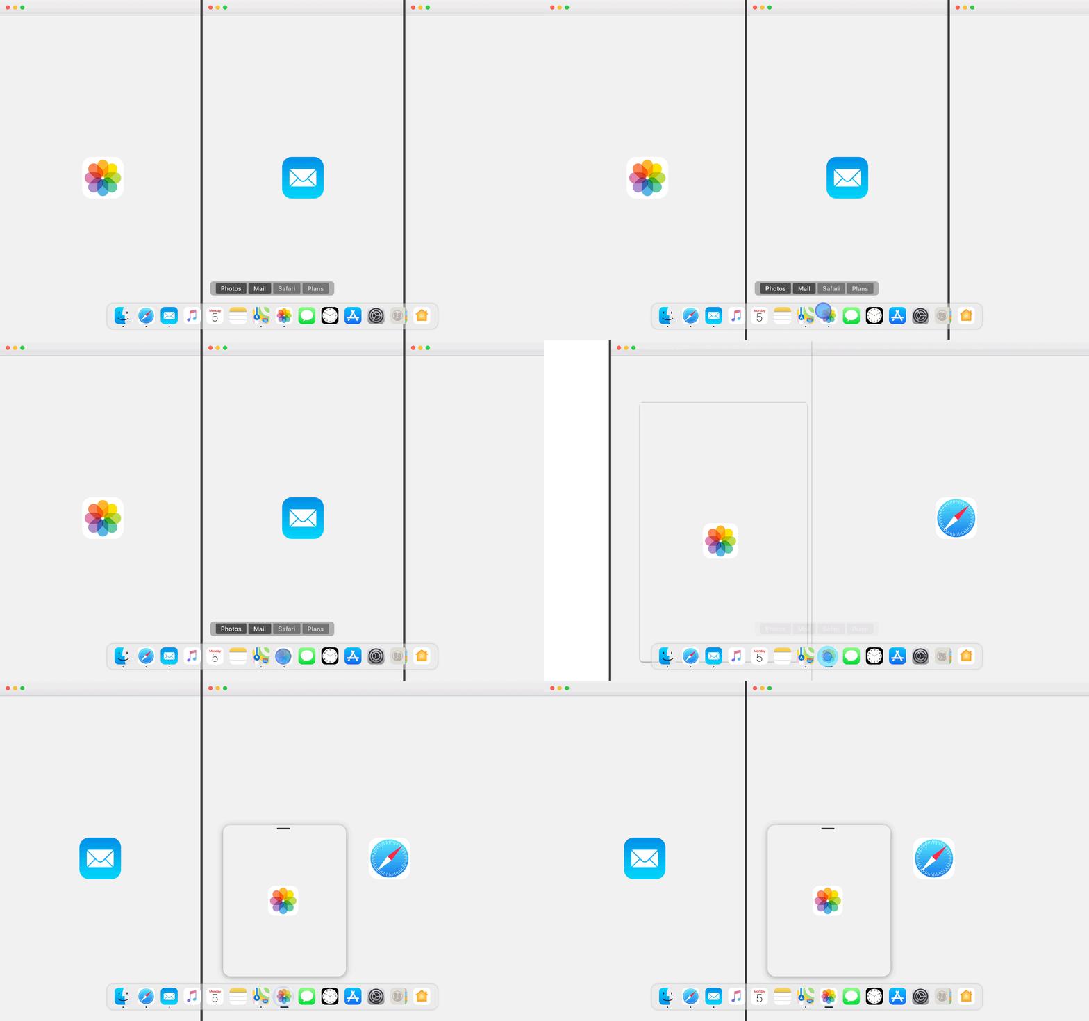
App-in-Picture has been designed to quickly check something, like the last document you wrote in Pages, or your last note. So, if you click somewhere on the Flow, the App-in-Picture window will be dismissed. You can quickly open it again by simply clicking the corresponding app icon; the little bar below the icon means that the app is currently in App-in-Picture mode. To get back to normal mode, you need to force click it again.
However, if you want to keep this window open while working on the Flow, you can by dragging it to one of the corners of the screen:

In this mode, App-in-Picture windows won’t be dismissed if you interact with the Flow.
You can add as many App-in-Picture apps as you want:

Notifications can also be converted into App-in-Picture apps simply by scrolling down on them when they pop up.
The New Desktop
The last part I want to mention in this concept is the Desktop. Like many of you, I try to keep it as ordered as possible, by putting files in folders deep in the file system when I can. I use my Desktop mainly as a kind of temporary folder, for files that need to be deleted in a near future or that I am currently working on as they are more easily reachable there. However, I find that the current system is not really coherent with this approach.
Usually, I work on Sketch for Mac and for my animations, I use Principle. When I create UI elements on Sketch, I render them in .png files to use them in Principle, and that’s the experience I end up with most of the time:
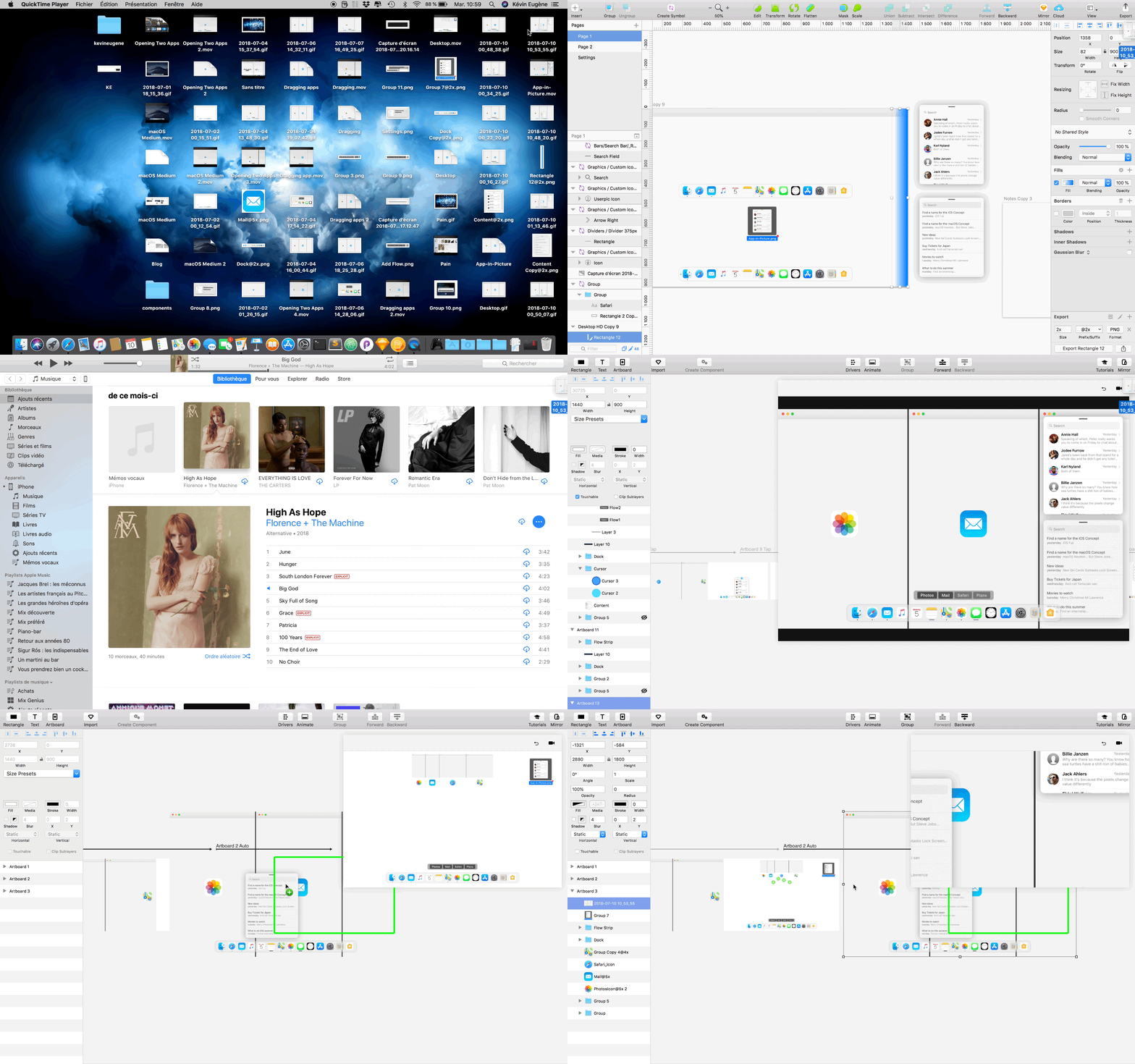
As I have so many windows open, I painfully drag my objects from one app to another until I finally reach my destination: it’s such a waste of time and it could be so much better.
In macOS Newton, the Desktop sits behind Flows. Remember that 4-finger swipe halfway up through the trackpad to open the Dock? It was halfway only because if you swipe up to the top, then you minimize the Flow to reveal the Desktop:

Now I can drag my temporary files to the app I want in no time:

Wrapping up
I first started working on this concept about two years ago, and I know how much two years represent such a long time in the tech world. I never managed to publish it because at the time I had so many things going on at the same time: UI-UX projects I wanted to finish as quickly as possible (like an iOS concept that you can find here), school, two internships, moving to Japan for seven months, and then school again. Eventually, I graduated, and finally, I can find some time to work on the projects that I like (like this Youtube Redesign I published not so long ago on Medium).
However, I find that this concept is still relevant today. The desktop has in fact really seen little to no improvement in its core UX, and those two years have helped me unconsciously process the concept and simplify it to the bone so it can become really useful for Mac users. Of course, this concept might need to be adapted (for instance, into a hybrid solution between windows and Flows, or a step up version of the iPad’s UI-UX), but I thought it was interesting to put those ideas out there.
I hope you like this concept and find it useful or inspiring. :) Please leave your feedback in the comments, I would gladly try to answer it.
Right now, I am working on my personal website to publish my concepts using high-quality videos and images. Also, there will soon be a new story on Medium about my iOS Fuji concept, revisited in a new brighter and better version, so stay tuned. :)
UPDATE: my new article is out! This time, I talk about iOS and try to improve Siri and the multitasking experience. Please go check it out, and give me your feedback! :)

