Redesigning Youtube for a more intuitive and modern experience
I spend a lot of time thinking about how to make our use of technology better. I use Sketch for Mac and Principle for my prototypes, and this time, I wanted to share with you my vision of a brand new Youtube experience. Your feedback is much appreciated. :)
Like many, I use Youtube a lot. Whether it’s for music, science, or just to relax, Youtube has become over the years a major source of entertainment and knowledge for me.
Since it is such a huge platform for most of us, I felt really excited and inspired to try to come up with better ways of using it.
Here’s how it goes.
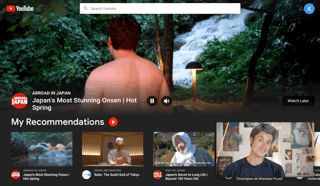
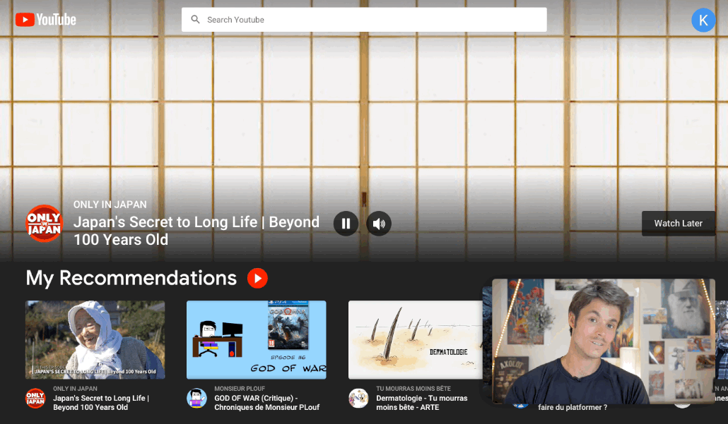
1. The Home Page

The new Home Page has been designed with a big emphasis on recommendations. In the background, the first video of the user’s recommendations is playing, but other videos can play depending on where the user puts the mouse. The background video can easily be paused or muted, and if the user finds it attractive, they can quickly add it to the “Watch Later” playlist or start watching it by clicking on the video’s title. The video will start where the preview ended.
The user can also quickly create a playlist with all their recommendations directly from this page, by simply clicking the red play button next to “My Recommendations”.
The idea is to create a relationship of trust between the user and Youtube’s Machine Learning algorithms so that their typical experience consists in launching “My Recommendations” and adjusting the playlist on the go.
Also, the new UI adopts a dark mode to highlight the content and be easy on the eyes.
2. The Player

There’s a lot to say about the new video panel as many of the core features have been tuned to stay coherent with the new orientation.
Like and Dislike buttons
In this concept, the Like and Dislike buttons sit on top of the video player. And it actually changes so much about their usage.
The problem with their current position is that they’re not accessible in fullscreen mode, while fullscreen mode is how I personally prefer to watch most of my videos on Youtube (and I guess a lot of people do). The worst part is that it is very easy and even encouraged by the current UI to jump to another video directly from the player. Sometimes, there’s even a counter before the next video starts playing.

As a consequence, most of the time, I end up leaving the video without having liked (or disliked) it. It’s something that should be avoided because then the youtubers are not rewarded for their work, and also because I missed a chance as a user to tell Youtube what my preferences were, and it can end up in less relevant recommendations. Sometimes, I also hit the Like button before even watching the video but that can prove misleading for the algorithms as well, and it’s not how the Like/Dislike buttons were supposed to work after all.
By simply putting the Like/Dislike buttons directly on the player, we ensure that they are made easily accessible throughout the whole video and especially at its end, thus providing a better and more coherent experience to the user.
The Right Column

On the right side of the panel, the UI suggests to the user potentially relevant videos. These suggestions are divided into 3 categories:
- My Playlist: which displays the videos in the currently active playlist. With the push of Instant Playlists (we’ll come back to it later), this part is bound to be very prominent and at the heart of the new Youtube experience. Think of it as the waiting queue that can be found in music apps like Spotify or Apple Music for instance. Videos from the categories below can be dragged onto this part and easily reordered. The user can also activate autoplay just by clicking the play button, and edit the playlist thanks to the three white dots. When the playlist has a name, “My Playlist” is replaced with it.
- My Recommendations: quite explicit as it is. Recommendations are based on the user’s habits and do not directly depend on what the user is currently watching. With the new experience, I wanted to make them easily accessible to the user wherever they are in the platform. This category is one that the user could launch and watch from the beginning til the end (once the relationship of trust is built); that’s why there’s a play button next to the title. When the user clicks the play button, recommended videos are transferred to “My Playlist”. “My Recommendations” is not editable as it is the results of ML algorithms, but videos can be dragged and put on “My Playlist”.
- More Like This One: this category is where videos that are similar to the one the user is watching are displayed. It would not be so relevant to put a play button there, as it is hardly possible for the user to be interested in each of these videos.
If we look at what’s currently being done on Youtube, there is no clear categorization or explanation about why a video is put there.
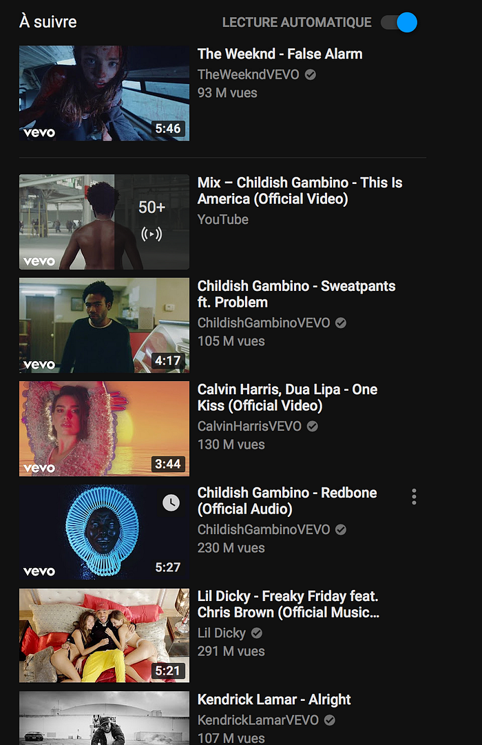
The user does not know whether the video is there because it is part of a playlist in which he happened to jump in, or because it’s from the same channel, or because it is similar to the one they are watching. Sometimes, there’s a small mention “Recommended for you” but it appears to be too random to make a rule out of it. Moreover, if the video is from a channel the user is subscribed to, the right column is cluttered with videos from the same channel, and does not help in widening their horizon and making them discover new kinds of videos they could also like.
In the new experience, the three categories (My Playlist, My Recommendations, and More Like This One) are consistent and displayed everytime a video is played, even when “My Playlist” is empty. I tried to use a wording that is as clear as possible, and explain in a few words the distinctions between the categories so the user understands precisely their purpose (“Based on your habits” versus “Based on your current video” for instance).
By using clear categories, we teach the user where to look for videos, and we remove the ambiguity from the suggestions which may leave them unnecessarily wondering.
Digital wellbeing and responsibility
This is a topic that I hold close to my heart, and it’s the notion of responsibility that tech companies have towards their customer base.
It’s good to build a platform with a huge amount of entertaining content, but with it comes the risk of addiction, and tech companies have to protect their users against it.
UI-UX designers have the responsibility to design systems that are empathetic towards their customers, and that give them enough space to do something else if they want to.
The new Youtube experience has been designed with this sense of responsibility in mind. And it shows in several areas.
For instance, autoplay (ie. playing automatically the next video) can be activated only within the playlists the user has created and never within computed recommendations where they didn’t have their say.
There is also a viewing limit that is set by default around 30 minutes. Once this limit is reached, the UI triggers a warning, inviting the user to do something else, and stops the current playback. This warning is also visible in advance so that the user knows beforehand where they should approximately stop watching videos.

Tools like this one are extremely important in content oriented platforms like Youtube or Netflix, as these are by nature tremendously addictive. The user absolutely needs to be aware of the time they spend on these platforms, so they can easily monitor their usage.
3. Picture-in-picture
Finally, picture-in-picture is coming to the desktop. And it looks great.

I guess this feature has been a long time request from mobile users.
Picture-in-picture is automatically activated when the video panel is closed, either by dragging it down, or by clicking the search bar. From the mini version of the video, the user can pause the playback, mute it, dismiss it by dragging it out of the screen, resize it, place it somewhere else, or put it back in the video panel by clicking it. When the thumbnail is playing, the background video of the Home page is paused.
This mode is really handy when it comes to multitasking: now the user can search for other videos without leaving the current one.
4. Instant Playlists
Instant Playlists stand at the heart of this concept. This is where all the puzzle pieces come together.
Instant Playlists are temporary playlists that the user can very quickly create, edit on the go, and start watching. Their usage is centered around drag-and-drop gestures.

When the user drags a video to the bottom of the screen, it is saved in an Instant Playlist and sits on top of the page in picture-in-picture mode; the playback does not start until the user said it so. Instead, the video disappears from the flow it was belonging to before being dragged (in the example above, “My Recommendations”) and the preview of the next video starts.
And there’s more to it.
The user can add as many videos as they want to the Instant Playlist, simply by dragging them to the bottom of the screen. That’s what the background previews were designed for in the first place: to help the user identify potentially interesting videos, and then add them to the Instant Playlist. Once the user is done selecting the videos they want to watch, they only need to click on the thumbnail at the bottom right to play it.
As said earlier, Instant Playlists are temporary, meaning if the user quits Youtube, they are lost. However, it is possible to save them by opening the edit menu. The user can also give a name to their Instant Playlist, delete videos from the playlist, and reorder them from there. Moreover, before quitting Youtube and if an Instant Playlist is still active, an alert will suggest saving it before leaving.
I like to compare Instant Playlists to the supermarket experience: the things you are interested in, you put them in the cart for future consumption.
So many times, I saw a video that piqued my interest, but for whatever reason, I started doing something else and never found it back. In the current version of Youtube, the “Watch Later” playlist is supposedly an answer to this issue. However, as it is hard to access our personal playlists in the current experience, videos that end there are left forgotten. No-one in my relatives, including myself, use the “Watch Later” feature as it is today, and I believe it is mainly due to a not so intuitive user experience. The cost of using it is too high.
Instant Playlists solve this problem thanks to a very simple workflow: you see an interesting video, you just drag it down (or onto “My Playlist” in the video panel); once you feel like it, just relax, and watch your selection (but don’t over-consume!).
Wrapping up
So, that’s it: the Youtube that I have in mind. I have tried to solve some of the issues that I had using the platform, while improving here and there the overall user experience in a non-intrusive way. Please let me know in the comments what you think. Any suggestion of improvement is welcome. :)
I still have other ideas in store, from productive ones, like tabs for Youtube or how to see one’s saved playlists, to funny ones that would potentially add even more personality to the platform, like hidden quotes behind video thumbnails. But for now, I prefer to leave it as is and see the feedback first before moving on to something else.
In a near future, I will post the whole concept on Behance and my personal website (once it’s ready, and I am working hard on it!), so stay tuned!
UPDATE: Check out my new story! This time, I try to redesign the Desktop experience on the Mac.