Member-only story
Part II
Responsive grids and how to actually use them: common UI layouts
How to use the right responsive grid and UI layout based on your design goals.
Now that you have a basic understanding of how to use grids, you might be wondering how to apply them to layouts you see on the web. Responsive grids are a method to systematically align your designs, to give order, establish hierarchy, and “logic” to your designs. It makes things look less floaty, and you can generally tell who is and who is not using a grid. As people become better designers, their eyes are constantly drawing horizontal and vertical lines everywhere to create that order and alignment.
On that note, I often get questions like “Wait, how do sticky panels work in a grid layout?” or “What do you do for a web app where things go edge to edge?” We’ll look at some applications of the responsive grid and also how they scale down to mobile. More importantly, I want to teach you how to mix and match your layouts to cater to your design needs.
If you’re not sure how to use grids in responsive design, read up on part one: Responsive grids and how to actually use them. Or just go with the flow, all good.
Disclaimer: I do not work at any of these companies nor do I know how they set up their grids. This is purely a learning exercise, and I am just using these sites as examples.
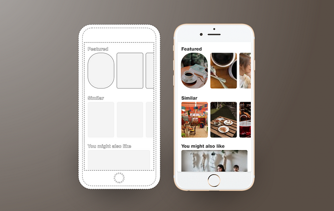
Single Column Layout
Aka full page layout. This is the most simple layout and is used for landing pages. You have all the space to display large images to create a statement that will enhance your product or brand. Things inside your one-column layout act as individual modules, and is easy to scale on mobile because things are already stacked in the order you want them to show. Because it is extremely powerful in provoking emotions, this is a common layout for home pages, introductions, how-tos, or new products, etc. Even though within the module there might be things split into different grid columns, as a whole the layout is utilizing 12 columns for main content.


