Solving the accessibility palette riddle
Cracking the code with the perceptive power of Delta E.

We are biologically unique individuals, identifiable by our fingerprints, DNA, and irises. The cells at the back of our eyes and the brain cells that process what we see are arranged uniquely in each person. I perceive color differently than you, and your perception differs from your partner’s, friends’, and coworkers’.
Biological deficiencies impact each individual in distinct ways. Consider protanomaly, a mild form of red-green color blindness that affects the red perception of 1% of the population; its effects vary in intensity from person to person. Are we talking about an impairment of 60%? 70%? 30%? Are there any concurrent impairments, such as deuteranomaly, which affects up to 5% of the population’s green perception? And to what extent? Does it affect one eye? Or both?
Since we all perceive the world through our unique color prisms, it’s impractical to rely on individual perception for gauging accessibility.
Therefore, what’s left when we remove colors from the picture?

Shades of gray. Contrast.
Light.
Its subset, Relative Luminance, accounts for our inability to process X-rays and infrared — our shared baseline. Therefore, as Colin Shanley explained, contrast is “the distance of luminance between two colors.”

This concept of distance explains why bright Yellow, Lime, Green, Teal, and Cyan would never work against White: their luminance is too close to one another.

The amount of perceived light determines Relative Luminance. Therefore, it is easy to believe that modifying a color’s luminosity creates more distance and, thereby, more contrast. But this approach is misguided, as Lea Verou challenged in her LCH article.
Luminosity is a distinct factor from Luminance. Its value stems from another color space, HSL, which, despite being used in contrast checkers, is not perceptually uniform. Eugene Fedorenko, the creator of Accessible Palette, has written an excellent and comprehensive article on this topic.

Sharpening our tools
HSL does not account for human perception of color. The output of modified Luminosity — the L in HSL — is either a foggy or chalky hue, causing 48% of designers to declare the shades of their accessible palette their number one frustration.
For instance, the only color with a 3:1 contrast to #DFF0D8 (light green) is #4E974F (a darker green), but 225 similar greens match the contrast ratio.
The technique, generating similar colors and testing them against accessibility, is not new: Tanaguru’s Open Source team found the answer in 2016, and even maybe before. Their algorithm uses the Euclidean distance, which looks for similar colors in the RGB space.
However, RGB, too, does not account for human perception of color. To do so, we need to use Delta E 2000. Designed by the International Commission on Illumination (CIE) as an equivalent of the Euclidean distance in the Lab/LCH space, it compares how perceptible the colors are by human eyes.
Therefore, if we search within a range of Lab/LCH colors with Delta E in mind, we should find the closest accessible color, as in the 225 earlier discussed colors.
What is an accessible color palette?
This wiggle room is beneficial when searching for a color that balances original color closeness, accessibility, and brightness. However, this approach, like every single one that exists today, has a significant caveat.
Designers who have experienced the daunting process of creating an accessible color palette can attest to the struggle. First comes the careful selection of the palette, then the accessibility check. What if we had a quicker way to identify which colors meet the guidelines while still exploring harmony?
How to attain accessibility in palettes that call for other hues, say, split-complementary? In other terms: what does an accessible color palette mean? Is it that all colors match the contrast ratio amongst one another? All against the primary or the neutrals? And amongst them, dark or light background?

Luminance benefit
In the case of Yellow against White: should you decrease Yellow’s relative luminance? Or White’s instead?
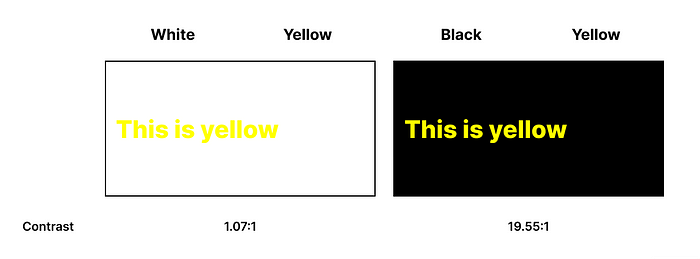
Physics and mathematics provide a straightforward answer: if the relative luminance exceeds 60% (or 0.6), a darker color will create more contrast, and vice versa.
I call this luminance benefit, also known as contrast polarity. It’s a derivative of the contrast ratio calculation, and it has been used for decades to determine if a text should appear black or white on a colored background. Adobe Color employs the same in its Contrast Analyzer.

Luminance benefit is a helpful indicator in our search for a consistent, accessible color. However, it doesn’t provide guidance on creating harmonious color palettes.
Addressing the issue
Adobe Color relies on the RYB model (Red, Yellow, and Blue as primary colors) used in Art for centuries to calculate color modes. It generates two hues, then shifts into the HSB color space to differentiate saturation and blackness. A simple study shows consistency across the methodology.

Using the same approach and coupling it with a Delta E accessible color search, we can generate hues at a minimum of 3 and 4.5 contrast ratios. These hues can then be tested against the neutrals of the primary color, as rightfully suggested by Open Source Color System.

Accessibility solved? Well, not so fast. This works well with modes that call for subtle degree change on the wheel, such as monochromatic and analogous, as their colors will most likely be paired with neutrals.

But now, let’s look at the Red-Green complementary pair, for instance. Mathematically, this pair achieves a 3:1 contrast. However, it would be a nightmare for anyone with protanopia or deuteranopia.
Adobe addresses this issue in their Color Blind Safe tool to draw the color out of the line of confusion, even though they recognize an “oversimplification of the actual problem.”

Thankfully, in their 2012 paper, Han and Yoo found that, as the a* value of the LAB color space represents the red-green percentage of color and b* the yellow-blueness, an iterative update loop on the b* value was efficient at getting out of the confusion line.
Shifting our perspectives
Their algorithm would generate a Magenta-Green pair instead of a Red-Green. But is it so bad?

The key to an accessible palette is whether or not we need to pair colors together. Therefore, two venues open before us:
- use an inclusive color pair, or
- use the color against a neutral.
That means maybe we should not try to shoehorn Yellow against White but find a color that complements its shine, such as a Deep Blue.

Designers don’t have the means to solve this with just a click of a button. Accessibility tools didn’t evolve much to offer a viable answer.
But what if…?

An algorithm has designed the Accessible and Color Safe Design System above. It calculated over 45,000 permutations in less than a second. It is more than a Developer would handle by hand or computational thinking.
Perhaps, the puzzle to challenge is why we still request Designers to address this problem.


