Design for conversations. Not screens.

We’ll draw the parallels between spoken conversations and Interface Design and the importance of establishing the proper Context, Message types, picking the proper Channels, and providing great Feedback.
“Design is really an act of communication.” — Donald A. Norman. The Design of Everyday Things.
Look at the Interface below and try to articulate what this System is trying to tell you.

When I see a person interacting with digital or analog products, I can’t help to notice a delicate balance between talking and listening. In recent years, I have started to approach Interaction Design the same way I would approach critical conversations with other humans — thinking of myself as an intermediary in an exchange between a user and a digital product.
Anatomy of an interaction
All digital interactions, no matter how simple or complex, have the same three parts; a trigger, an object, and a response.
Therefore, every interaction is already very similar to the way you speak:
“If you tap (Trigger) on this button (Object), then the form will be submitted (Response).”
The Anatomy of a Conversation
Communication is the act of conveying meanings from one entity or group to another through mutually understood signs, symbols, actions, and semiotic rules.
Essentially a conversation is an interactive communication between two or more entities; a source and a receiver. It is composed of one or several exchanges between the different parties. Each exchange in a conversation is made up of the same parts, and the information flows in the same way.

- Environment. The location in which the Conversation takes place. It can be both physical and psychological surroundings. Every aspect of it can affect communication, such as how much light there is, how noisy it is, indoors vs. outdoors, the device being used, etc.
- Context. The situation or circumstances under which the communication takes place. We don’t say the same things the same way in different contexts. Context and Environment affect each other.
- Sender/Source. The Source is the entity that triggers the Conversation (interaction). It determines what is to be communicated, encodes it into a message, chooses a channel, and sends the Message. This entity can be the System or the user.
- Message. A message is a stimulus produced by the Source that affects the Receiver. It is the information that travels from one entity to the other. It can be intentional or not, and it may contain words, movements, expressions, sounds, actions, etc.
- Channel (or… UI Element). The Channel is the object or means chosen by the Source to transmit the Message. Often the impact produced by any given message can vary depending on the Channel that was chosen to convey it. In Interactions Design, Channels are the UI Elements and visual cues we use in our interfaces.
- Receiver. The person who receives the Message. They analyze and interpret the Message to understand the meaning and possibly act on it. Like with the Sender, this can be the User or the System.
- Feedback. Feedback is a response to a message that the Receiver sends to the Source. In digital product design, they can be visual cues, UI elements, or written words. Thanks to the Feedback, the Message’s Source can see whether the Message was understood as intended. In some situations, Feedback is not openly given. However, Feedback allows us to correct what was misunderstood. Feedback makes communication a shared process and is one of the most critical components of Interaction Design.
In every interaction with other people, we subconsciously use these components. For example, when it is someone’s [Reciever] birthday, you [Source] usually wish them “Happy Birthday!” [Message] on the day they were born [Context] and not three months before or after. Also, you may choose the place [Enviroment] in which you say this and the tools [Channel] you use to say it (a birthday card, a balloon, a text, etc.). And if everything goes well, you might get a “Thank you” [Feedback] from the Reciever.
In contemporary digital products, the user usually communicates with the System via inputs and gestures, and in most cases, they are the ones who start the conversation/interaction. When a user [Sender] taps on a button [Channel] that says “Compose” or “Add to list” [Message], for example, they initiate the Conversation by sending a message to the System [Reciever], letting it know their intent within that [Context], and the System replies appropriately [Feedback].
Although a conversation is always a two-way interaction, we will mainly address System — to→ User Messages — meaning messages initiated by the System, or shown as a response to a user’s action and intent. I will also explain the importance of Context for these messages, the Channels used to communicate them, and Feedback provided by the System.
The Context
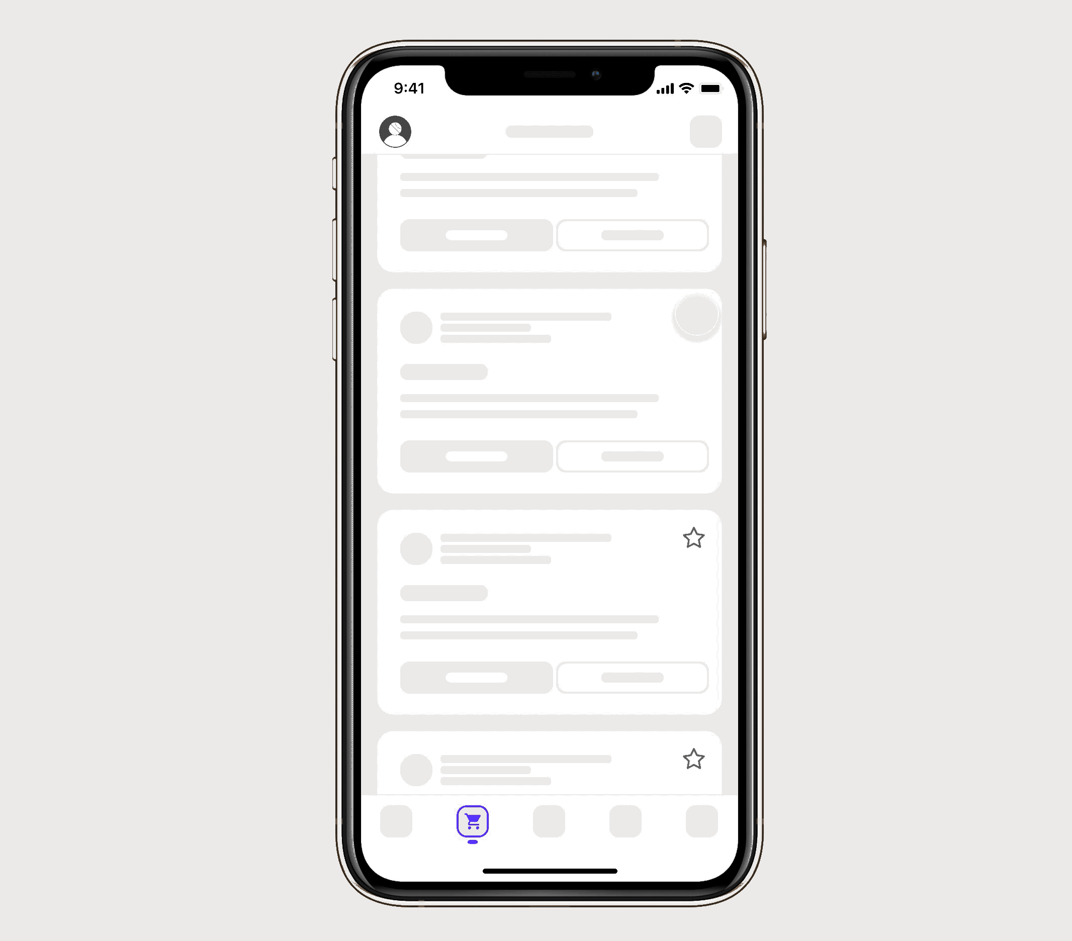
To help illustrate the importance of Context in Interaction Design, let’s demonstrate a task taken by the user as a spoken conversation — similar to Conversational Design or DoNotPay’s approach to Experience Design. Below is a fake app interface that allows you to add items to a shopping list, amongst other things. If the user wanted to add a new item, how would that interaction, or Conversation, take place?
On the left, the Interface. On the right, the Conversation.
In this example, every exchange between the system and the user remains in context as the system actively works to help the user finish their task. There are no interruptions or unnecessary changes in context, and the system simply reacts to the user’s inputs letting them be in control. Notice the nudge at the end to turn on notifications.
Let’s see what to avoid now…
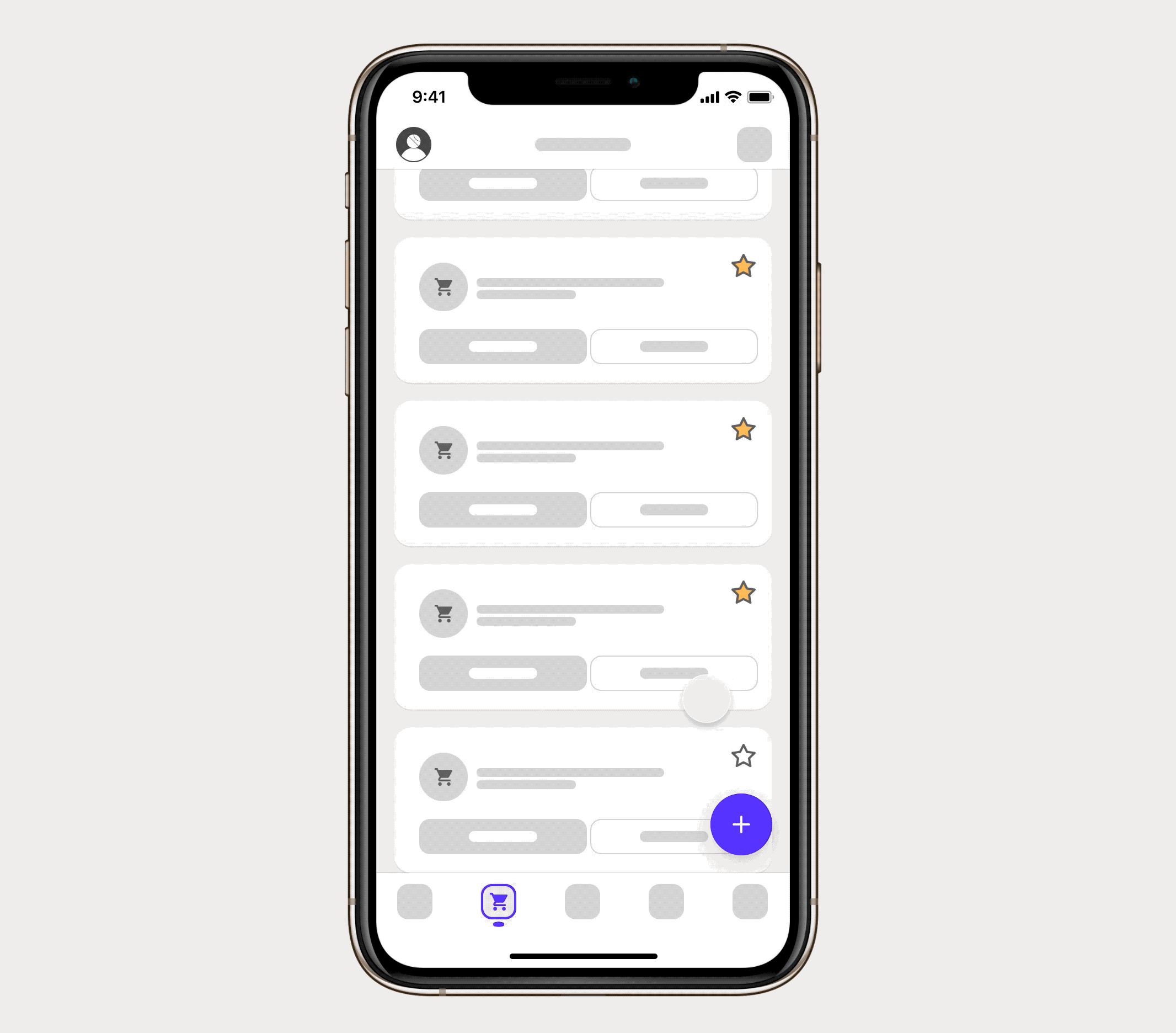
On the left, the Interface. On the right, the Conversation.
It started great until the system introduced a Change in Context in the middle of the conversation by asking the user if they wanted to turn on their notifications. This Change in Context is the equivalent of stopping a person in the middle of a conversation, getting in their face, and yelling something that may have no relation to what you were talking about. The number of items already added to the shopping list indicates that this is an avid user of the application and may have consciously turned off notifications — something I do all the time.
A better approach would have been to wait until the end of the current conversation to present a new idea in a non-interruptive way. Since the nudge activates a separate conversation, there is a Change in Context, and the user’s intentions change.
Don’t interrupt the user unless you have new information that’s critically important and contextually linked to the task. Instead, wait until the user is leaning back before giving them additional data or a new idea. If you introduce new concepts during pauses in the Conversation, users are less likely to feel distracted and overwhelmed. That means they’re more likely to pay attention to what you’re telling them.
Distractions
As with any other type of interaction, keeping distractions to a minimum is essential. Our brains get overwhelmed when there are too many distractions, and our fight-or-flight response takes over. When we get into this stressed mode, our focus narrows, and we tend to concentrate on short-term solutions rather than the best overall outcome. In other words, we can’t work most efficiently or optimally. Each distraction presented to users is an extra thing they have to pay attention to increase Cognitive Load.
Alerts vs. Notifications
There are times when calling the user’s attention is appropriated and very much needed. In these cases, there are two interface concepts that are explicitly designed to grab the user’s attention and distract them from tasks; in-app Notifications and Alerts.
Notifications
In-app Notifications are designed to be ignored.

Most of them appear in the peripheral areas of the screen. They’re non-modal, which means they don’t take focus and don’t need to be dismissed before the user can carry on with their task. Notifications can be contextual — applying to a specific UI element — or global — referring to the System as a whole. Users’ immediate actions do not trigger them, and they announce an event that has some significance to the user.
Alerts
In-app Alerts are designed to be acknowledged.
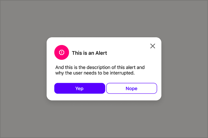
They usually appear in vital central areas of the screen accompanied by a Scrim, typically in a modal window that must be acted on before your user can continue using the application. That means they require action from the user.
Your job as a designer is to determine whether the information you want to give to your users is important enough to classify as an alert or whether they’re only notifications. Before interrupting the user always ask; How important is this information to the user at this specific point in time?
On the other hand, embracing thoughtful friction when it prevents abuse, protects privacy, and steers people towards healthier digital habits will be appreciated by your users.
When deciding which Channel to use, start with a contextual/inline Notification, and work your way up to an Alert.
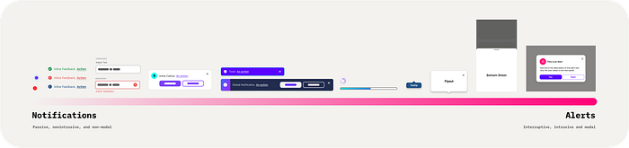
Messages and their Channels
As we saw, a Message is an information you want to convey to the user. We can use words, symbols, and UI elements to communicate this information in contemporary digital product design.
All messages conveyed by the System can be categorized into the following Message types, and there are several viable Channels we can use for each type.
- Recommendations
- Feedback
- Educational
- User Confirmation
- System-wide Events
Remember that the suggested Channels below are not meant to be an exhaustive list, and the names may vary according to the platform (iOS, Android, Web) and other conventions.
Recommendation Messages
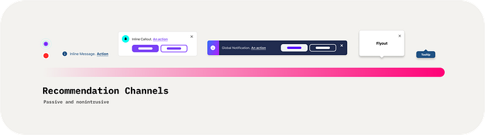
Recommendations are System-triggered messages meant to call a user’s attention passively and entice them to perform a specific action. They may be triggered without the user expecting them, and they do not require the user’s immediate attention. When using these types of messages is critical to communicate the benefits of the proposed action within Context and avoid using interruptive Channels (more on this later). This will ensure the user does not associate these messages with ads.
It is also essential to minimize the usage of Recommendations to prevent the user from becoming overwhelmed. If Recommendations are not managed holistically, a user can potentially see multiple of them in one session. Aim to show up to two different Recommendation messages per user’s session to avoid the user becoming numb to these types of messages and start ignoring them altogether.
Suggested Channels:
Feedback Messages

Each time the user takes an action, the System should react to the input somehow. Most of the time, this Feedback is subtle transitions in the UI, like when a button is clicked or an input field is active. However, when the user performs more complex actions such as creating, loading, updating, or deleting content, System Feedback messages inform the user about the status of operations in the background. They also give users the confidence that the System performed its intended action. Feedback messages are always shown due to a user’s input; therefore, they represent the Feeback step in a user-initiated conversation.
When dealing with destructive or “high-stakes” actions, it is best practice to provide an option to Undo that action. Like when you delete a photo from the Cloud or when you send an email, show a Snackbar or Toast to provide Feedback that the action was taken and give the user a way to recover in case they forgot to attach that document they meant to attach.
As a rule of thumb, make sure the Message is noticeable by using motion or color, or shape transitions. For example, when showing a Toast, make sure it is visually distinguishable from the rest of the screen.
Suggested Channels:
Educational Messages

Educational messages help the user perform an intended action or convey information that the user should know in that Context. These messages should always be in-context with a passive or partially-interruptive behavior, meaning the user can ignore these messages and is not required to act on them. Like with Recommendation messages, it is essential to use them minimally. Remember that too much help in one specific Context can make the user feel overwhelmed; therefore, they will ignore these messages. Consider Progressive Disclosure when showing these messages.
Suggested Channels:
User Confirmation Messages

User Confirmation messages ask the user to verify that they want to proceed with an action. These messages test the user’s understanding of their intended action in most cases. Most of them are presented with an interruptive Channel, so the user pays close attention to what they confirm. This makes the Message interruptive and requires the user to respond to continue using the application. It may be paired with a warning or critical information related to that action and its consequences.
As a general rule, Confirmation messages are not necessary when the consequences of an action are reversible or negligible. Only interrupt the user with User Confirmation Channels when you absolutely have to, and you have explored all other venues.
Suggested Channels:
System-wide Messages
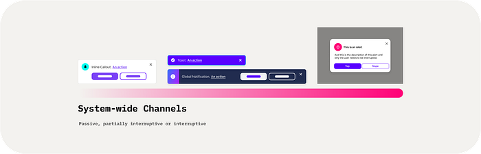
System-wide messages inform the user of events of a global nature and reflect whatever is happening in the entire application. This pattern doesn’t work as well for situations in which the message is more effective if it can be contextual. Usually, these messages appear at the top of the screen in a central location, overlaying the page content so the user cannot miss them. These messages have some urgency, but generally, they do not block nor interrupt the user.
Some examples are the messages we see when there are Network Connectivity issues, upcoming downtimes, problems with payments, etc.
Appropriate Channels:
Channel Behaviors
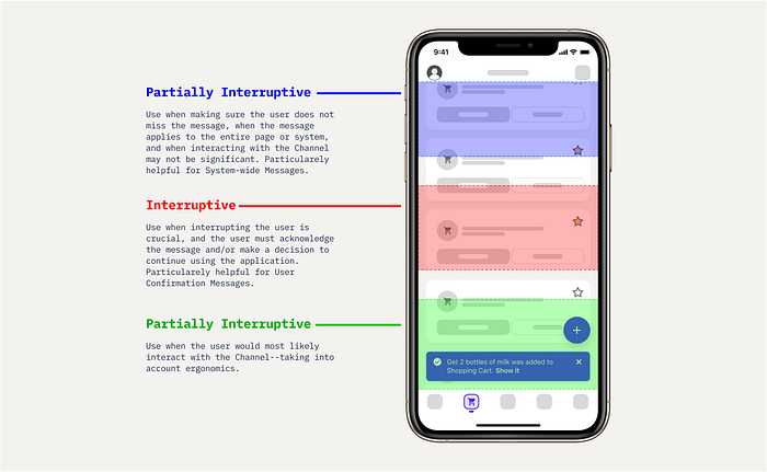
Passive
Passive channels are notification elements that do not interrupt the user’s task. They are also non-modal and are usually placed in line with the page content to avoid obstructing other surrounding content. They are best used in pauses in the Conversation or when the System should provide contextual Feedback. Some examples are Notifications Badges, Inline Feedback, Input Validation, etc.
Partially Interruptive
Partially Interruptive channels are notification elements that obstruct other surrounding content but may not interrupt the user entirely. In most cases, they are also non-modal and are usually placed overlaying the page content. The user is not required to interact with them, and they can be ignored. However, because they overlay other content, the user either actively dismisses them or in some cases, the System dismisses them for the user. Examples are Toasts/Snackbars, Global Notifications, non-modal windows, etc.
Interruptive
Interruptive channels are alert-like elements that obstruct the entire page and block the user. They are modal, and the user must interact with them to continue using the application. As we have seen, these messages can be viewed as distractions in the Conversation, so limiting their usage is highly recommended. Examples are Confirmation Dialog, Modal windows, and Modal Bottom Sheets.
Persistence
Message persistence depends on the Channel. Most Passive and Interruptive Channels stay in view until the user actively dismisses them, interacts with them, or the event that triggered the Message is resolved. Most Partially Interruptive Channels, such as messages using Feedback Channels, are automatically dismissed after a certain amount of time. However, this introduces a usability problem for people with cognitive or mobility impairments. It is essential to ensure the user has had time to acknowledge and understand the Message. Instead of automatically dismissing messages, try:
- A Settings feature allows the user to specify the amount of time for in-app notifications.
- Leave the Message in view until the user performs a gesture or action that is completely decoupled from the Message/Channel, such as scrolling, navigating somewhere else, or interacting with an unrelated element on the page.
Avoid showing multiple channels for the same Message — for example, when the user deletes or moves several Objects of the same type in a list. Instead, try batching related messages into one Channel and display a count. If the Channel is dismissed, all related messages within it are dismissed as well.
Placement
Message placement also depends on the type being used. As a general rule, always start with Passive channels placing them inline close to the relevant content. This makes sure the user does not miss them and makes it easier to interact with them if they need to — see Fitts Law.
If Passive Channels are not adequate for the Context you are in, move into Partially Interruptive and Interruptive Channels, and keep in mind:
It is important to remember not to let anything in your Interface look like an advertisement or, more generally, make sure you aren’t making users’ eyes dart all over the screen.
Motion
Motion can also aid in communicating messages. Humans are conditioned to look out for things that move, so ideally, most System — to →user Channels would transition from one minimized or off-the-screen state to their final position using motion. This aids in the discoverability and spatial relationships between elements.

Some users might be highly sensitive to motion effects and may turn on features provided by the OS that minimize Motion, such as the Reduce Motion in iOS. When Reduce Motion is on, specific screen effects change or are disabled on your device, including:
- Screen and element transitions and effects use the dissolve effect instead of zoom or slide effects.
- Parallax effect where your wallpaper, apps, and alerts that move or shift slightly as you tilt your device are disabled.
- Animation and effects in certain apps are disabled. For example, weather animations in the Weather app.

Do not rely on Motion alone to communicate something as a best practice. If you show a Message to the user, rely on color and shape instead to make the Channel visually distinguishable from the rest of the page.
Closing thoughts…
As you probably know, when you hold a conversation with another human, certain etiquette is expected. The same is valid for Interaction Design. Try judging your designs the same way you would a host at a party. If they are talking too much, being overly helpful (annoying), interrupting people, or not trying to engage with the guests, they won’t come back.
Listen
“True listening involves setting aside of one’s self.” — M. Scott Peck.
Listening is the most fundamental rule in productive conversations but the least applied. For User Experience and interaction design, that might mean prioritizing Usability over Profitability. Conversations with users should not be promotional opportunities for the latest features you just designed — hopefully, your Interface speaks for itself. Instead, our interfaces should listen to the user’s input and gestures so that when our Interfaces do have to talk, they have something valuable to say.
Remember that each interaction or exchange the user has in an application is part of a more extensive conversation between the System and the user — design for the Conversation and not the screen.
Good conversationalists are usually good UX/UI designers.
“The best UI is no UI”
Finally, when designing a solution, try to create it with no Interface in mind. Before wireframes, before wire-flows, before Figma, try to write down the interaction (Conversation). It will let you identify those pauses where you can speak up and show value to your users.
If you have any feedback/comments/suggestions, please share in the comments. I would love to hear your thoughts.
Resources
Just watch this video…
PS. If you have any feedback or I forgot to include a common UPDATE pattern, let me know so we can add it.
Let’s help each other build better experiences. For everyone.
Stay safe,

