Working with color
Did you ever find it difficult to fully color an artwork? Or figure out what colors would work well together in a color palette? I remember having all those challenges and being extremely frustrated at how difficult it was to work with color.
Growing up as an artist and a designer, I learned from many industry professionals and art instructors who taught me how to work with colors. Here are some of the advice and tips they shared with me.
First thing’s first, understanding a bit of color theory helps. The color wheel is a great reference to understanding which colors work well together.
Here are the basics: there are three primary colors, red, blue and yellow. The complementary colors, orange, purple and green, are made by mixing two primary colors. For example, red and yellow make orange, blue and red make purple, and blue and yellow make green.
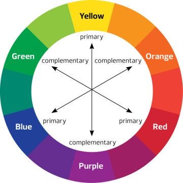
Note that the complementary colors will be important if you are trying to create darker neutral tones. For example if you wanted to make a shadow of an object with a yellow hue, you should use the complementary color across from it, which is purple. The reason you use a color instead of a shade like black or gray for shadows is that it makes the whole artwork look richer if you used colors instead of shades.
“…but in a technical sense, black and white are not colors, they’re shades. They augment colors. ‘And yet they do function like colors. They evoke feelings. They can be a kid’s favorite color,’ says graphic designer Jimmy Presler.”
— Adobe
Sylvain Sarrailh’s The Luxembourg Gardens painting is an example of how yellow and its complementary color, purple, work well together (yellow being the ground’s color, purple being the shadows on the bottom left):

If the shadows were black or gray, they would not blend in as well with all the other colors on this artwork. The artwork would look a little bit more dull and bleak if the shadows were black. As long as the shadow has a bit of color, even if it looks close to black (like the shadows of the trees in Sylvain’s artwork), it will still work together better with the rest of the piece than it would with black or gray.
That is not to say that using black is 100% wrong, there are just better alternatives for certain situations. Why use black straight out of the tube when you can mix colors for a variation close to black? That variation that is close to black will mesh in with the colors of the painting much more smoothly. Creating a black that has a slight bias towards another color will only enhance your work.
Though complementary colors might help your color palette look richer, you do not always have to use the complementary colors when you are looking to make a shadow. You can look to other colors to make it richer, but complementary colors are usually a very safe bet! You just have to work with how much of the complementary color do you want to add to your shadows? Is there another color that can help you achieve a better feel to it?

Krenz Cushart’s artworks are also incredible because of how rich his colors look because of the way he uses other colors to enhance them. Every shadow of his has more than one color implemented, and he uses the complementary color additions as well as made other color variations to make his piece look rich in color.
Some more advice would be to work with neutral or gray-like colors first and then work with saturated colors last, because colors with a gray or neutral tint will work better together than if you were to put saturated colors together. Marco Bucci’s video on Color Theory gives a great explanation and demonstration on how and why neutral colors blend much more smoothly.

If you still have trouble working with color, make your paintings in grayscale first and then start slowly transitioning towards color. Marco Bucci also covers this in his Grayscale to Color Art Process video. However, just like Bucci stated in his video, when you use this method, the colors will still look slightly dull compared to if you started with colors right off the bat but this is still a good first step into working with colors. The more familiar you become with working with colors, the less you will need to start off in grayscale. It’s just that when you start with grayscale, you are focusing more on values over hues.
When it comes to working with colors in UI design, it is important to establish hierarchy through colors. It leaves the viewer less confused if the design has a sense of hierarchy. It can make the content more readable for certain users, it can also draw attention towards call-to-action elements. Overall, it has the potential to enhance the users’ navigation capabilities.
It also helps to apply the golden ratio in color proportion. The rule states that you should use the 6:3:1 ratio because it allows the users to navigate through the content much more easily. It allows them to notice which elements are more important, which are usually the call-to-action elements. While you do not have to use exactly the 6:3:1 ratio, it’s good to keep in mind what elements you want to bring to attention and how to go about it.

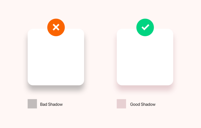
The next time you make a drop shadow for a card or a UI design, think about putting in a small bit of color into the shadow and not using just a black or gray shade. It makes a big difference, check out Christian Vizcarra’s in depth guide on colors in UI Design!
