6 (more) tips to quickly improve your UIs
More small and easy to put into practice tips to improve your designs.

Creating beautiful, usable, and efficient UIs takes time, with many design revisions along the way.
Making those constant tweaks to produce something that your clients, users, and yourself are truly happy with. I know. I’ve been there many times before myself.
But what I’ve discovered over the years is that by making some simple adjustments you can quickly improve the designs you’re trying to create.
In this follow up article (You can find Parts 1 & 2 here, and here), I’ve once again put together a small, and easy to put into practice selection of tips that can, with little effort, help improve both your designs (UI), and the user experience (UX).
Let’s dive on in…
Oh. Before you read the rest of the article…
🏠 Growing a SaaS startup? I combine strategic design with proven founder experience to help you build products users love.
Join the Haus waitlist for early-bird perks → https://gohaus.design/
1. Colour-Pick from your images, and bring your products to life

Simply colour-picking from your product images, and then applying various tints and shades of your chosen colour to your background, text, icons or more, can add plenty of visual interest, and character to your designs.
2. Try to create generous Tappable areas on Mobile

When designing for Mobile try to create Tappable Areas large enough for fingers to, well, tap successfully.
Things can be challenging for Buttons, and Links that consist only of Text so try to go for an Icon with a Label whenever possible.
Here’s the minimum recommended Tap Areas for both iOS and Android…
44 x 44pt for iOS
48 x 48dp for Android
3. Keep the contrast ratio acceptable between light text, and images

Always make sure light text is legible against, well, lighter image backgrounds.
Simply applying a slightly opaque darkened background behind your text will keep a good contrast ratio between those elements.
It also allows you to easily switch between dark, and light images without the hassle of changing the text colour.
4. Check out these great Fonts; Perfect for Headlines in your designs

Here’s a selection of Serif, and Sans-Serif Commercial Fonts that I’ve used many times before, and found they work really well for Headlines, bringing a bit of warmth, and character to any design.
You can find them at fonts.adobe.com (No, I’m not getting any commission).
5. Check out these great Fonts; Perfect for Body copy in your designs

Behold a small selection of both Serif, and Sans-Serif Commercial Fonts that I’ve used consistently for long-form Body text, and highly recommend.
You can find them over at fonts.adobe.com (No, I’m still not getting any commission).
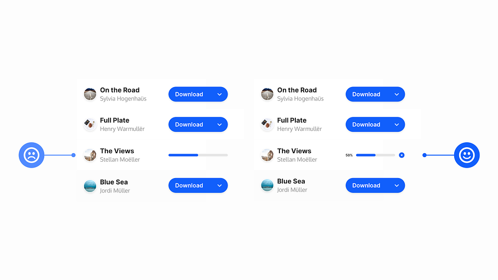
6. For Download Indicators, try to be as informative as possible

The one time you don’t want to go with the super ‘Minimal’ look is when it comes to Download Indicators.
For the user, try to make your Download Indicators as informative, and user-friendly as possible.
You can achieve this via the use of colour, a percentage figure to show the current progress, and a simple icon giving them the ability to cancel the download at any time.
Oh. Before you go…
🏠 Growing a SaaS startup? I combine strategic design with proven founder experience to help you build products users love.
Join the Haus waitlist for early-bird perks → https://gohaus.design/


