No, Apple is not moving towards neumorphism
And it’s not moving back to skeuomorphism either.

I’m not a fan of neumorphism. If you follow me here or on Twitter, you might have noticed I’m usually quite critical or, at least, skeptical about this visual style. There are several reasons, from accessibility issues to, for sure, a simple matter of personal taste.
In the past months, countless articles have been written on the topic. Besides the ones indicating this as a “2020 trend” (yea, like if this year wasn’t bad enough already), just because “it’s all the rage” on Dribbble, some designers rightfully investigated a little more.
Now, I’m not here to say neumorphism is good (it’s not) or bad (it is). But in the last few days after Apple’s WWDC2020, I’ve seen more and more articles saying basically that “APPLE IS EMBRACING NEUMORPHISM!!111!1!2”.
My answer to that is: where?!

What are the characteristics of neumorphism then?
I’m confused. Maybe we should first agree on what we can define as neumorphic. If we take a look at the results popping up on Dribbble (where the whole charade started), I think we can identify a common ground to help us decide if something is following this trend or not.

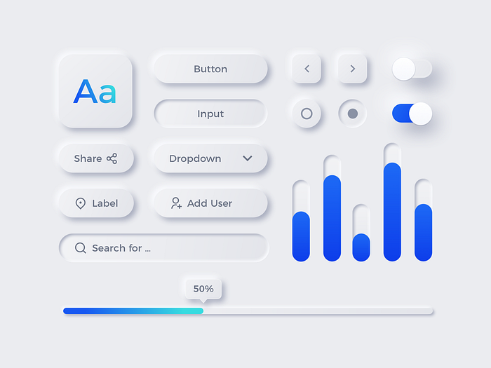
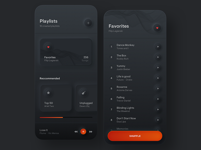
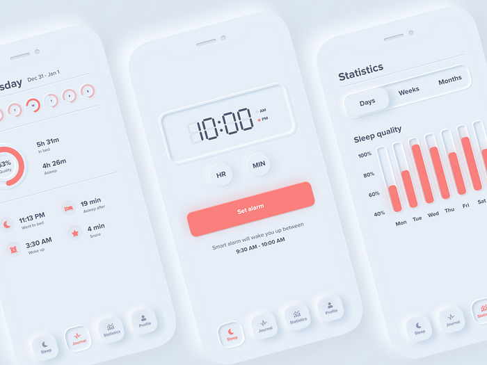
The most evident principle is that most UI components are designed as if they were solids underneath the background pushing towards the surface. Shapes are defined by their shadows and highlights, generated by a hypothetical light source, usually in a corner.
In most cases, buttons done this way have the same color of the surface they lay on. So, for example, a button on a light grey background is also light grey (hence the discussion about accessibility).
This is neumorphism in a nutshell.
Now…


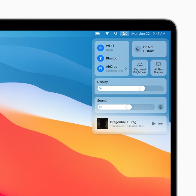
I have a really hard time to find similarities between what we have seen of MacOS Big Sur and the examples of neumorphism above. The only thing I have found, that vaguely resemble that (but actually it doesn’t) is this:

I don’t think this slider is enough to say MacOS Big Sur is a step into neumorphism for Apple. So help me here. If you’re one of the people convinced that the new MacOS is winking at neumorphism, please help me understand in what exactly.
Back to skeuomorphism?
I think we can all agree there is nothing skeuomorphic in MacOS Big Sur besides some app icons. But let’s talk about them. First let’s see a comparison with the current ones.

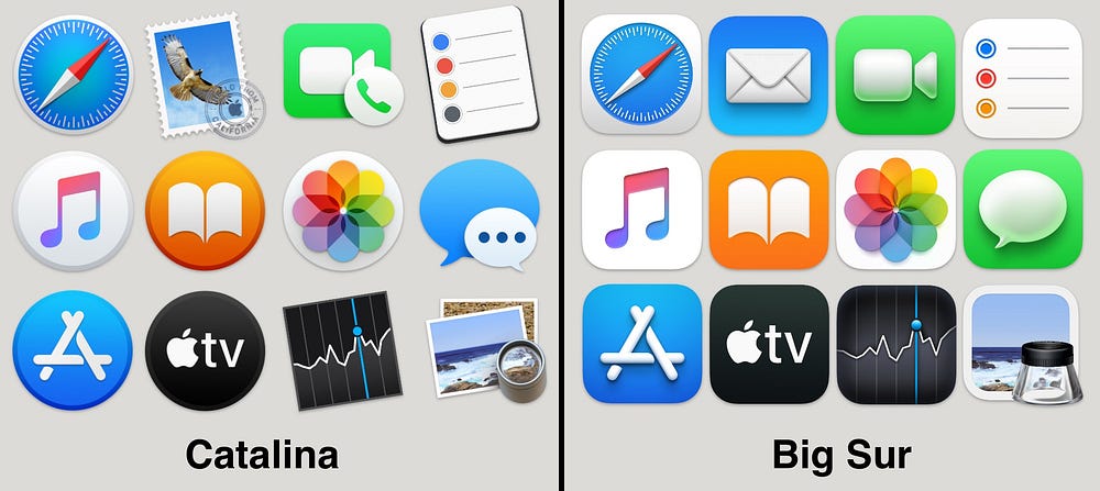
Now, take a look at the Mail icon, or the Preview icon… Can we really say that MacOS is going BACK to skeuomorphism? Sure, some icons, like Facetime and Messages have a more 3D look on Big Sur, but NOT skeuomorphic. The Preview icon is skeuomorphic (both old and new), Facetime or Messages icons are 3D(ish). Other icons, for example the Reminders, is less skeuomorphic on Big Sur than on Catalina, where it looked more like a real “notepad”.
In any case, there is no “going back” if you never moved forward.
Icons on MacOS have always been skeuomorphic, there’s nothing new here. What they are doing is a step towards the look app icons have on iOS and iPad OS. My guess is that this is a compromise before unifying all the operative systems.

What they did is finding a way to convert iOS icon design through the lens of the visual language of MacOS (for icons). So there’s no return to skeuomorphism, they simply never left it.
For some reason, it seems some people can’t really leave this neumorphism alone, despite the clear evidence that no major product as yet converted to that “trend” (is a trend that no one really uses still a trend? A question for your philosophical urges).
Is MacOS Big Sur following trends? Yes. Subtle gradients, soft shadows, translucency are some of the trends we’ve seen going on for quite some time now. Is there anything pointing to neumorphism? Not really, no.
Some of its icons are 3D or skeuomorphic! Yes, just like they’ve been for years.
⬜️⬜️⬜️⬜️⬜️⬜️⬜ 👧🏻👧🏼🧒🏻👦🏼👧🏾👦🏿👧🏽👧🏻👧🏼🧒🏻👦🏼👧🏾👦🏿👧🏽👧🏻👧🏼 ⬜️⬜️⬜️⬜️⬜⬜️⬜
My new book “Designing Digital Products for Kids”! Out December the 4th!
Learn the secrets to design successful digital products for children.
You’ll find answers to all your questions regarding the industry, and its peculiarities in 📐 UX design, 🎨 UI design, 🔍 user testing, 📈 business strategies, and much more.
⬜️⬜️⬜️⬜️⬜️⬜️⬜ 👧🏻👧🏼🧒🏻👦🏼👧🏾👦🏿👧🏽👧🏻👧🏼🧒🏻👦🏼👧🏾👦🏿👧🏽👧🏻👧🏼 ⬜️⬜️⬜️⬜️⬜️⬜️⬜

