
Redesigning Siri and adding multitasking features to iOS
After working on a redesign of Youtube and publishing my concept for macOS, I decided I should take care of one of my most beloved platforms of all time: iOS for the iPhone.
Back in 2009, hardly anyone around me knew what an iPhone was: the next big thing in tech had not hit the shores of France yet. The first time I saw it with my own eyes was at a restaurant with my aunt (yes, the same who had a huge iMac in her living room). She had brought it with her and I spent the whole evening on it. I remember how amazed I was by the responsiveness of the screen and how natural the multitouch gestures felt to me. Until then, touch screens had meant resistive technology (you know, those touch screens where you had to press really hard to do anything) and it clearly didn’t allow for such a smooth experience. Back home, I begged my parents to buy me an iPhone and a few months later, I happily received my glorious iPhone 3G for my birthday.
The phone lacked crucial features, like a video camera, and sending MMS was not even possible at the beginning, but I couldn’t care less: the user experience was miles ahead of the rest of the industry, and the App Store had a lot of potential for the years to come.
Almost ten years later, iOS has improved so much, and the excitement lives on as Apple concocts a new version bundled with new features each year. This time around, I wanted to imagine an update that I would personally be excited about if it showed up at the WWDC, and this is what I came up with.
Let me introduce you to iOS Mogi.

« Hey Siri, help me »
The first part of this concept is focused on Siri. The idea here is not to create new commands, rather to display existing vocal requests that work well (like « Find me a good restaurant nearby » or « Get me pictures of Japan I took last year ») in a different way so they could be more useful to the user.
In iOS Mogi, Siri has been designed around a concept I call parallel help. The idea is to have a vocal assistant that is non-intrusive (it won’t take the whole screen like it does today), context aware, and can do things in the background for the user while they are doing something else.
As images are more explicit than words, here’s a very simple example:

When using apps, Siri takes the shape of a notification so as to be less intrusive as possible (if summoned from the lock screen or the home screen, it will still be fullscreen).

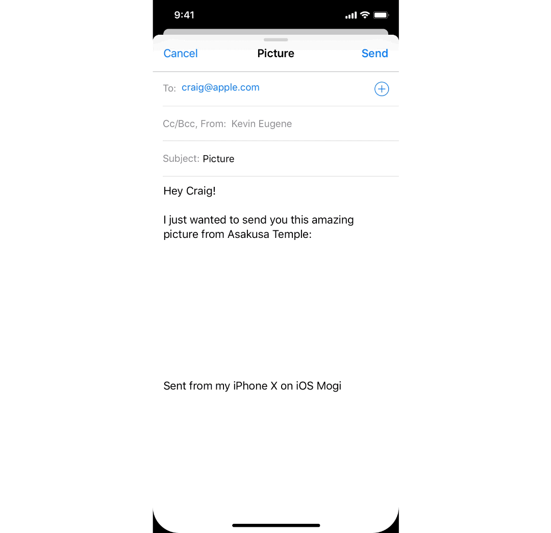
In the example above, I ask Siri to show me pictures of Japan as I want to send one to my friend Yannick. Once the request is fulfilled, the result is displayed in the Siri notification so I can continue to do what I was doing without being interrupted. I can swipe down the notification to reveal more and select the photos I want to send.

Or, I can directly drag a picture from the expanded notification to the app below (finally putting to contribution the drag-and-drop API on the iPhone):

If it has not been used for a while, the notification shrinks down to the top:

And it is possible to open it again by swiping down from the top of the screen (we’ll come back to it later):

What’s really cool about the new Siri is that the results it displays can be used in another app very easily if needed:

I believe designing Siri to be non-intrusive allows for so many use cases and could make a real difference with its competitors, thanks to its deep integration into the OS. Here’s a few examples of what could be achieved with this new Siri:


And there’s even more to it. In iOS Mogi, it is possible to ask Siri to show pages from an app while doing something else on another one. So, for instance, I could be writing an email and wanting to add a picture that a friend sent me on iMessage. Here’s what it would look like in iOS Mogi:
That’s the beginning of a true multitasking on a mobile device, and I think it is more adapted to the mobile limitations than just vertically splitting the screen in 2.
« Hey Siri, I want to… »
You know how sometimes, you feel frustrated when you try to send a message with Siri, and end up taking your phone and typing your text? In iOS Mogi, instead of relying completely on Siri to do things for you, you can ask it to help you get things done faster. No more wandering in the UI, simply begin your sentence with « I want to… » and Siri will let you do it, without leaving what you were doing (in iOS Mogi, what you are doing is really precious).

And it works right from the lock screen:

« Hey Siri, scroll down a bit »
With Siri now being completely non-intrusive, new use cases show up. One of them is Siri actions.
Siri actions basically translate any touch gestures into voice commands. From the tap to the scroll, everything can now be performed using solely vocal requests. So I can ask Siri to scroll down my list of albums for instance, and open High as Hope from Florence + The Machine.

Elementary use cases like this one were previously not possible as Siri would take the whole screen and would not be context aware. Now, when writing an email for instance, I can ask Siri to change the recipient on the go, modify my signature, or even change the style while I am writing my email:
I think it would be a huge step forward for disabled people in particular. Siri actions would make it easier than ever for them to navigate in the OS. Even for non-disabled people, I think it would be really useful when hands are busy, like when cooking for example, or just to make some redundant tasks easier (as seen above in Mail).
And things could go even further thanks to ARKit 2 which has proved to be precise enough to track the eye (but let’s try to keep things simple for this concept):
I believe that Siri actions are very coherent with the initial approach of Siri, which was to allow users to perform simple actions with their voice. Making Siri non-intrusive just takes it a step further.
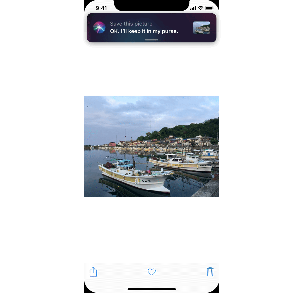
Siri actions also come with a new ability for Siri: saving elements from anywhere to use them elsewhere. Open a photo, and say « Save this photo » for Siri to save it.

Open another app, and drag the photo from the Siri notification to the app:
And it works for copy-pasting too:

Simply tap to paste your text in the current app where the cursor is at. You can also drag the content to where you want:

You can ask Siri to show you all your saved elements with the sentence « Show me all my saved elements »:

Once saved elements are used elsewhere, they disappear from the list.
And that’s it for the new Siri. Now, what if we applied the same principles of non-intrusive multitasking to other areas in the OS? Surely, the new gestures and visual code could be applied elsewhere. What could we do with it? Before digging further into this idea, let’s see if we can improve the experience in a particular area where I personally spend a lot of time: Apple Maps.
Apple Maps
Don’t hate me, but I really enjoy Apple Maps. Although some of its data may not be as trustworthy as it should, especially here in France, I find the user experience and interface very delightful. The drawer at the bottom introduced in iOS 10 when the app was redesigned is truly a brilliant idea. No wonder have we started to see it appear in other apps, like Lyft for instance.
However, something that has been bothering me from time to time is the lack of context awareness, especially when using transportation systems. More specifically, when I’m using a line, and that I try to get new directions, Apple Maps doesn’t know I’m stuck in that line and gives me directions based solely on my current location, while it should base the computations on my current location and current line. Very often, I end up given directions from starting points that are unreachable from where I am; at this point, navigating in Apple Maps becomes useless.
Surely there must be ways for Apple Maps to infer which line I am currently using. Lines are known from Apple Maps, maybe it could just check my position and compare it to the trajectory of the line. Once the algorithms determine that I may be using, say Keiō Line in Tokyo, here’s what could happen:

A prompt could ask the user if they’re really using Keiō Line. The prompt can be dismissed by swiping it down, or if the line is correct, but not the direction, it is possible to swipe left or right until the right direction is found. Once the user confirms their line, Apple Maps would calculate new directions based on this information:

3D Touch the small black button to have a linear view of your position on the line in real time:

Why am I suddenly talking about Apple Maps and in what way is it coherent with the previous part you may ask? Well, here’s the thing: iOS lacks ways of keeping users updated about things that are happening right now. Sure, it uses some tricks here and there to do so, but they feel like hacks, as we’ll see a bit later. Typically, I think it would be really interesting for users to easily keep track of their route while doing something else (like playing or reading in the subway) and they should also be able to quickly go back to Apple Maps (or their favorite navigation app) without having to open the App Switcher or go back to the Home Screen.
In response to this issue, let me introduce you to Live Notifications.
Live Notifications, or the multitasking for mobile
First and foremost, let’s highlight how iOS tries to inform the user that things are happening in the background.
There’s the timer:

During a phone call/Facetime:

During an itinerary:


When using the phone as a personal hotspot:

When the screen or a memo is being recorded:

And… that’s it (I didn’t put the music player in the list as it is treated a bit differently, and I don’t see why it should be changed).
What about when a Uber is on its way? When food is to be delivered? When a video is playing on Youtube or Netflix? Or when… we’re using transportation and need to easily keep track of the route? (😜)
It’s good that Apple made phone calls or Apple Maps’ itineraries easily accessible (in the status bar or in the Lock Screen). However, the ways of doing so are too restrictive (restricted to a few native apps and no action can be triggered without opening the corresponding app), they should be accessible anywhere and anytime without interruption of the current task, and some of them are not visually coherent and well integrated into the system. In a nutshell, they feel more like a quick fix that hacks the system than a true feature, and there should be a better and more elegant solution to handle these situations and more (it should be open to third-party apps as well!).
Live Notifications were designed to solve this issue.
Let’s take our earlier example of a user reading a book on Apple Books while on a metro line. Here’s what it could look like to have a peek at the current route:

To have a glimpse at their current position on the line, the user simply needs dragging down the small bar at the top of the screen.
To open Notification Center, drag further:

And just like that, in a few seconds and without leaving Apple Books, the user can know where they are on the line and not miss their stop.
These gestures should feel familiar to you. If you remember well, these are the same ones as for Siri. In fact, in iOS Mogi, Siri is a Live Notification as well. So, all the gestures that were introduced before are also available for other tasks.
For instance, in this case, the user can swipe down the Live Notification to reveal their position on the map in real time. They can also trigger actions right from there:

If they want, they can also tap the Live Notification, just like a normal notification, to open the corresponding app:

Live Notifications are the natural evolution of Rich Notifications introduced in iOS 10. Now more than ever, they feel like mini apps.
How does one trigger Live Notifications? They have nothing to do. Apps determine whether they trigger Live Notifications or not, depending on the situation. When a Live Notification is activated, this is what happens:

The app shrinks down into a Live Notification to notify the user, then into a little bar at the top of screen to prevent intrusiveness.
Here’s a few examples of how things that are happening in the background could be handled by the OS thanks to Live Notifications:


Live Notifications can also be used to quickly share something:

Same for screenshots which can now be shared with a single drag-and-drop:

When multiple Live Notifications are running at the same time, they stack in iOS 12 fashion:

They can be easily rearranged with drag-and-drop so you have your favorite Live Notification on top of the rest:

And of course, Live Notifications are also available directly from the Lock Screen, so it’s easy for you to have a glimpse at your itinerary or get back to where you were:

Wrapping up
That’s it for iOS Mogi. iOS Mogi is the third iteration of a concept I started about 2 years ago (at the same time I started working on macOS Newton). Back then, it was called iOS Fuji.
Since the beginning, I have wanted to find an elegant way to bring multitasking to the mobile, and splitting the screen was never an option. I wanted something that was more coherent with the mobile approach, and I hope you find that Live Notifications are a good step into that direction.
As always, generous, genuine and generative feedback is appreciated. :)
EDIT: My new article is out! This time, I try to rethink live collaboration on iOS. If you want to see how Live Notifications could be used elsewhere, please head to this story.

