UI & UX micro-tips: Volume six
A collection of handy tips to help improve your designs instantly
When it comes to building efficient, accessible, and beautiful user interfaces, the smallest changes can make a massive difference.
In this follow-up article, I’ve provided you with another set of easy-to-implement UI & UX micro-tips.
Tips that can improve both your designs and the user experience with minimal effort.
Quick Note: Want even more UI & UX Micro-Tips? Then check out my previous articles below…
- UI & UX micro-tips: Volume one
- UI & UX micro-tips: Volume two
- UI & UX micro-tips: Volume three
- UI & UX micro-tips: Volume four
- UI & UX micro-tips: Volume five
Let’s dive on in…
Oh. Before you read the rest of the article…
🏠 Growing a SaaS startup? I combine strategic design with proven founder experience to help you build products users love.
Join the Haus waitlist for early-bird perks → https://gohaus.design/
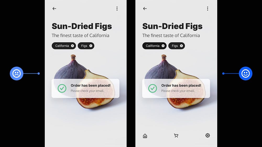
1. Try to keep the Tab Bar a constant within your Mobile App.

If the user is going more than two levels deep into your app, make sure the Tab Bar is there to help them get back to where they need to quickly.
Too many taps aren’t cool and will bring frustration to any user.
Try to keep the Tab Bar a constant within your mobile app, and avoid those unnecessary tap backs.
2. Using only Weight can create Emphasis and Hierarchy within your Type.
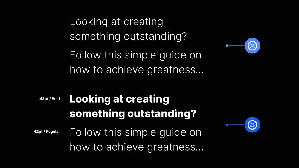
Emphasis and Hierarchy using only Weight? Oh yes!
Staying within the same type family and simply varying the family member’s Weight can signal a shift in Hierarchy even when the point size is unchanged.
Sometimes Weight is all you need to create Emphasis and Hierarchy within your type. Yup. It’s really that simple.
3. Try and create generous tappable areas on Mobile.

When designing for mobile, try to make Tappable Areas large enough for fingers to tap successfully.
The minimum recommended Tap Areas for both iOS and Android are -
44 x 44pt for iOS
48 x 48dp for Android
Our fingers come in various sizes, so give ’em some room and make it easy for the user to tap accurately without too much frustration.
4. Make your site’s navigation as consistent as possible.
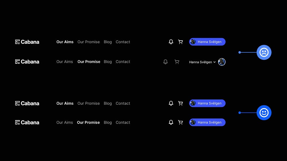
Follow best practices and try to keep your navigation consistent across your site.
Even minor changes can cause cognitive dissonance and frustration for the user.
There may be minor exceptions to the rule on certain types of sites but keep that navigation consistent for the majority.
5. Content-heavy site? Make that Search a prominent feature.
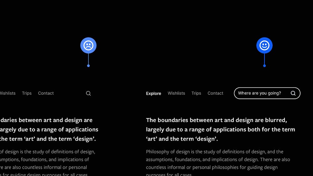
Whenever possible, aim to make Search a prominent feature on your content-heavy site, especially when viewed on desktop.
Try not to hide your search feature solely behind some teeny-tiny symbol as it plays an essential role on content-heavy sites, and demands a little more attention.
Make it prominent and visible on desktop and you’re good to go!
6. Don’t just choose font sizes at random. Use a Type Scale.
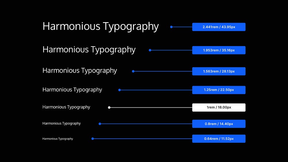
When you need to define a collection of font sizes fast, practically, and without any guesswork, use a Type Scale.
As the name implies, a Type Scale operates on a scale factor (say, 1.25).
The approach is to start with a Base font size (ie; 18px) and multiply (or divide) it by the scale factor (ie; 1.25) to get font sizes of a higher (ie; H1, H2, H3, etc.) or lower hierarchy (ie; Caption, Button, etc.).
Using a Type Scale will help you create texts that look harmonious, and quickly bring consistency, rhythm, and hierarchy to your typography.
I hope with this short collection of tips you’ve realised how the smallest of changes to your designs can produce better results for both yourself and the user.
Oh. Before you go…
🏠 Growing a SaaS startup? I combine strategic design with proven founder experience to help you build products users love.
Join the Haus waitlist for early-bird perks → https://gohaus.design/


