Why is the phone keypad different than the calculator? — and more UX links this week
A weekly selection of design links, brought to you by your friends at the UX Collective.

A brief history of the numeric keypad ›
By Francesco Bertelli. Picture the keypad of a telephone and calculator side by side: a calculator has the 7–8–9 buttons at the top whereas a phone uses the 1–2–3 format.
Subtle, but puzzling since they serve the same functional goal — input numbers. There’s no logical reason for the inversion if a user operates the interface in the same way. Common sense suggests the reason should be technological constraints. Maybe it’s due to a patent battle between the inventors. Some people may theorize it’s ergonomics.
With no clear explanation, I knew history and the evolution of these devices would provide the answer. Which device was invented first? Which keypad influenced the other? Most importantly, who invented the keypad in the first place?
A portfolio hiring managers can’t deny ›
What makes for a good portfolio? In a sentence, a portfolio that has the highest likelihood of landing a job indicates you already have the skills to do what you’ll be hired to do.
Disruptive interfaces and the emerging battle to be the default ›
As modern interfaces like voice remove options, augmented reality overlays our physical world, and artificial intelligence gains our trust by transcending our own reasoning, defaults will rule the world.
Personas make you stupid ›
What if we stopped putting people in contained boxes and acknowledged the variety of attributes that make up a human?
If you like the links, don’t forget to 👏👏👏👏👏👏👏👏👏👏👏👏From the community
Stories by Elaine Tran, Shawn Park, Yaz, Giulio Michelon, João Araújo, Jason Ford, Arin Bhowmick.
- My aha moment as a UX designer
- How and why I redesign my portfolio every year
- Why the most popular apps are starting to look the same?
- Using design to prevent people from sharing stuff they didn’t read
- Design Systems: benefits, challenges & solutions
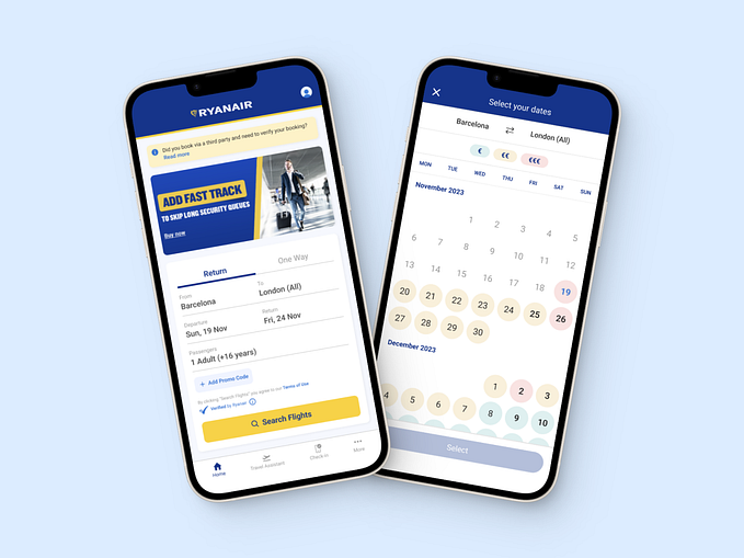
- Rethinking the date picker UI
- Designing a place for designers
News & ideas
- Uber-uber has a new visual identity — again
- An inside look at Facebook’s impossible job of moderating 2 billion people
- This guy is asking cold callers to donate to charity in exchange for attention
- Smelvetica: a font that ensures your message is always ey e c at c hi ng
- A guide on how to stay scrappy in your design process
- Turns out ugliness is underrated in Design
- If you haven’t noticed: our desire to give back wanes rapidly with time
Tools & resources
- Phase: yet another design and prototyping tool for UI designers
- GDIGB: an archive of beautifully designed IBM posters
- Ikonate: customizable vector icons for download
- Gamification: a guide on how to gamify without the gimmicks
- Hourly App: find out at last how long it takes to get things done
- Touring Bird: explore, compare, and book experiences
- Trendy palettes: a collection of beautiful hand-made color schemes
A year ago…
Touching up blemishes on Sephora’s UI ›
By Priyanka Gupta. Through usability testing, I discovered that many users struggled with navigation within the app to find relevant features that they wanted to use. Based on my research findings, I designed some solutions and validated them further with additional usability tests.
If you like the links, don’t forget to 👏👏👏👏👏👏👏👏👏👏👏👏


