7 (more) tips to quickly improve your UIs
More small and easy to put into practice tips to improve your designs.
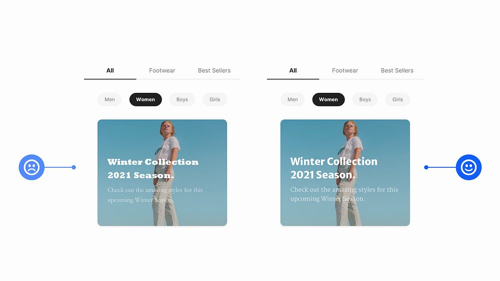
Creating beautiful, but practical UIs takes time, with many design revisions along the way. I know. I’ve been there many times before myself.
But what I’ve discovered over the years is that by making some simple adjustments you can quickly improve the designs you’re trying to create.
In this follow up article (Here’s Parts 1, 2, and 3), I’ve once again put together a small, and easy to put into practice selection of tips that can, with little effort, help improve both your designs (UI), and the overall user experience (UX).
In this part I’ve focused primarily on Typography because I know how beneficial a good understanding of type can be when it comes to producing beautiful, practical designs.
Let’s dive on in…
Oh. Before you read the rest of the article…
🏠 Growing a SaaS startup? I combine strategic design with proven founder experience to help you build products users love.
Join the Haus waitlist for early-bird perks → https://gohaus.design/
1. Use Superfamilies when you’re looking for great font combinations, but fast

Is it a bird? Is it a plane? Nope. It’s a Superfamily!
When you’re looking to improve your typeface-combining skills and feel a little daunted when faced with 1000s of Typefaces to choose from, just go with a Superfamily.
Superfamilies are collections of Typefaces that can come in both Serif, and Sans-Serif variants for example, and are created to work together in close visual harmony.
A few that I highly recommend are Merriweather & Merriweather Sans, and Roboto & Roboto Slab.
If you want to combine Typefaces effectively, and without the worry of picking out an ugly looking combination you’ll rarely go wrong when choosing a Superfamily.
2. Reduce Letter-spacing on your Headings to give a better optical balance
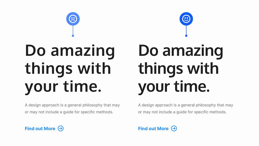
Reducing Letter-spacing on long-form Body text? That’s a big no-no!
But for Headings…
… that’s a resounding ‘Yes’ from me!
Your Headings are most likely going to be much larger, and heavier than their Body text companions, so the spacing between the letters can sometimes appear optically larger, which is not always what you want when you’re looking for that perfect aesthetic.
Reducing the Letter-spacing, just by very small amounts, can make your Headings more optically balanced, more readable, and generally more pleasant to look at.
3. Get that Vertical Rhythm just right for your Headlines and Body Text
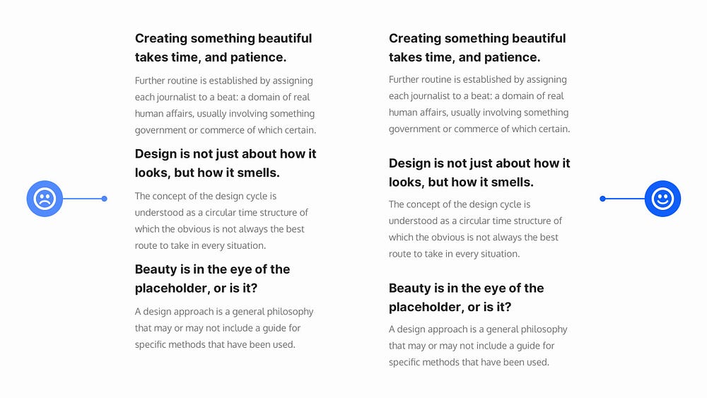
When you want to achieve a good Vertical Rhythm, as well as a strong Visual Hierarchy between text elements in your designs it pays to get your Margins in order.
I’ve seen a lot of designs, most commonly in lists of articles, where they’ve applied equal top and bottom margins to headings, and in doing so have lost the connect with the body text below it.
In cases like this, I’ll always give more top margin to my headings, and a little less at the bottom so the connection between the headline and content beneath is stronger, there’s a good Vertical Rhythm, and Visual Hierarchy is preserved between all the articles.
4. Try to use All-caps on short titles only, such as Kickers
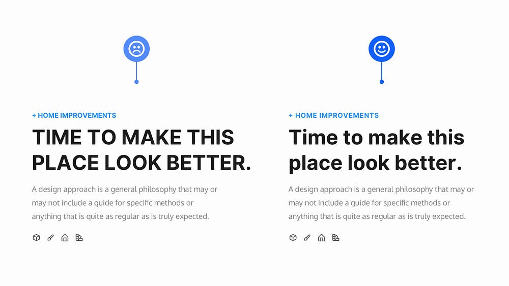
If you want to use All-caps on your Titles make sure they’re pretty short whenever possible, preferably one line. Using them for longer texts is a really bad idea.
One of the best places is on Kickers (sometimes known as Overlines). These are those short phrases, only a few words usually, that can appear above your titles, and are perfect when you want to put All-caps into practice.
And like the Tip previously, adding a subtle amount of Letter-spacing to titles with All-caps applied can also allow them to breathe, and look better optically.
5. If you can keep your titles short, and concise… ‘Just do it’
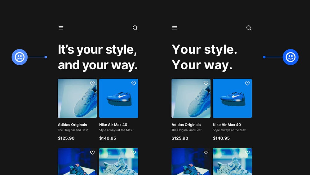
If you can, and if it’s suitable, keep titles short, snappy and to the point.
For example. Instead of ‘It’s your style, and your way’, simply use something like ‘Your style. Your way.’
People scan, and keeping those titles short, and punchy helps them digest the information much quicker.
Remember that it can come across quite abrupt this way, and you need to take into account the type of project you’re working on, and the intended audience to decide if this method is suitable, as opposed to the more standard format.
6. When choosing a multi-use Typeface, try to find one with plenty of weights
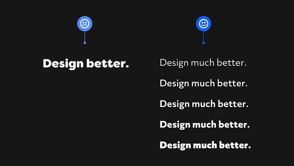
Does the Typeface you’ve been scouting out come with a generous selection of weights, and styles?
Try and make sure it does if you intend on using it for a few of your projects.
Just the one weight, or style. Nah. I recommend steering clear of those if you can.
There are exceptions of course, and certain projects will require that ‘one style only’ more elaborate typeface, but for the vast majority of projects you want Typefaces with a little more in the way of… well… choice.
Even if you decide on using just two or three weight or styles, give yourself the breathing room if you need to call on more at a later stage in the design process.
7. Choose the right Typeface to give the correct ‘voice’ to your design
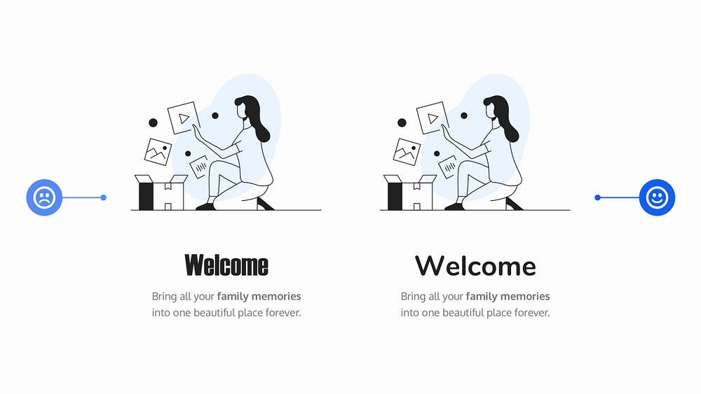
When working with text on a project, choosing the right Typeface will influence the kind of voice that your text is spoken in. Be that loud, or soft, friendly or formal, serious, or fun.
Each Typeface has its own distinctive voice, and it’s about finding the appropriate voice for the project you’re currently working on.
When you’re new to working with Typefaces this can seem like a daunting task, so don’t be afraid to be inspired by similar projects out there, and take ideas from them to help both influence your decisions, and improve your understanding of what is suitable.
Oh. Before you go…
🏠 Growing a SaaS startup? I combine strategic design with proven founder experience to help you build products users love.
Join the Haus waitlist for early-bird perks → https://gohaus.design/


