UI & UX micro-tips: Volume eight
A collection of handy tips to help improve your designs instantly

The smallest changes can make a massive difference in creating efficient, accessible, and beautiful user interfaces.
In this follow-up article, I’ve provided you with another set of easy-to-implement UI & UX micro-tips.
Tips that can improve both your designs and the user experience with minimal effort.
Quick Note: Want even more UI & UX Micro-Tips? Then check out my previous articles below…
- UI & UX micro-tips: Volume one
- UI & UX micro-tips: Volume two
- UI & UX micro-tips: Volume three
- UI & UX micro-tips: Volume four
- UI & UX micro-tips: Volume five
- UI & UX micro-tips: Volume six
- UI & UX micro-tips: Volume seven
Let’s dive on in…
Oh. Before you read the rest of the article…
🏠 Growing a SaaS startup? I combine strategic design with proven founder experience to help you build products users love.
Join the Haus waitlist for early-bird perks → https://gohaus.design/
1. Start your messages with the goal first, not the action.

Always try and construct your messages to the user in the correct order.
When describing a goal, and the action required to achieve it, begin the sentence with the goal.
Constructing your messages in this format will make them more easily understandable and help reduce user error at the same time.
2. Are your shadows actually coming from one light source?

Make sure your shadows are always cast by one light source, which, surprise, surprise, is usually from above.
Creating shadows cast at different angles is a simple mistake to make, yet it can leave your designs appearing sloppy.
Remember, we don’t inhabit a land with a thousand suns.
3. Use White Space well to achieve a more robust Visual Hierarchy.

White space. Negative space. Get the balance right to build a solid visual hierarchy on the page.
Too little white space can completely erase visual hierarchy and leave the user feeling overwhelmed and distracted.
White space needs to be balanced to preserve readability, support scannability, and aid the user’s focus.
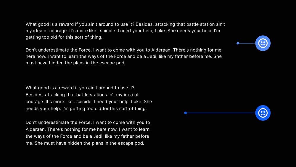
4. Improve readability by choosing the right line length for your body text.

Working with Body text and determining a suitable line length can be a balancing act.
A line length of 45 to 75 characters is widely regarded as adequate for a single-column page, with a 66 character line (which includes both letters and spaces) found to be the sweet spot.
Of course, font-size and line-height play a factor in determining readability, but for line length, stick to the 45–75 character limits, and you’ll be fine.
5. Prompt initial user action with helpful empty states.

Empty states. Highly beneficial in improving the user experience, but so often neglected.
Use empty states as an opportunity for the user to quickly discover features that will benefit them, get them to accomplish their goals sooner, and use the site or app as you intended.
Please don’t leave your user at a loss on what to do first, and start them off on the right foot.
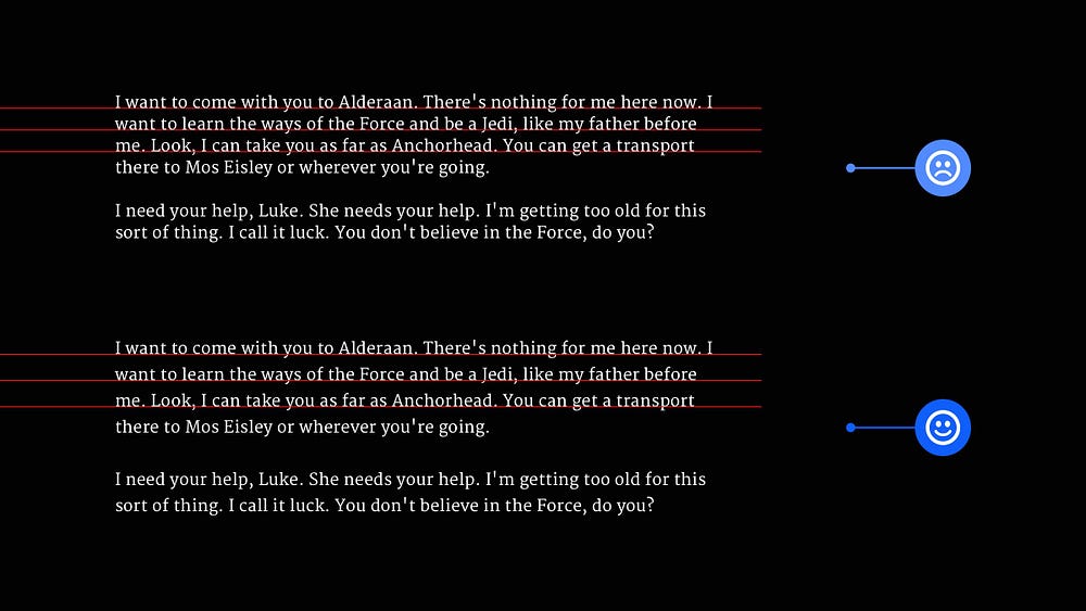
6. Set your line-height based on the Typeface’s x-height for optimal readability.

Typefaces with differing x-heights need, well, different line-height measurements to achieve optimal readability and legibility.
Merriweather, for example, is a Typeface with a large x-height, and as such requires a larger line-height.
In contrast, something like Mr Eaves Sans with its small x-height requires less line-height to achieve the best readability.
With this short collection of tips, I hope you’ve realised how even minor adjustments to your designs can produce improved results for both yourself and your users.
Oh. Before you go…
🏠 Growing a SaaS startup? I combine strategic design with proven founder experience to help you build products users love.
Join the Haus waitlist for early-bird perks → https://gohaus.design/

